Warren, straight off the bat I'd like to tell you that this is a great image! It really is no surprise that you ended up placing as well as you did.
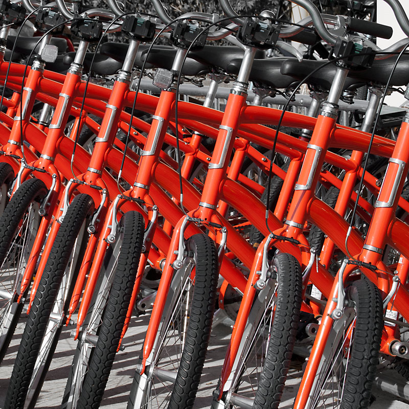
The composition is really solid with the red bicycle frames forming a lovely leading line through the image from right to left. On top of that, you have a really great pattern of bike tires and frames forming a lovely cohesive effect throughout the frame. Lovely details in the tires and overall sharpness really rounds this out lovely. I'm a big fan of the selective desaturation in this image. To do desat right takes a great amount of restraint, and you exercised that beautifully.
Technically, I personally don't find any flaws in this image. However, something small is missing that would've nudged it into the 6.5+ range. Perhaps this something would be some extra little element to surprise the viewer with, like a human element, or a bike frame of different color. Something to just inject a little color or other form of counterpoint to the image to give the eye something to focus on. Right now the wanders looking for a point to settle on, but since all the frames are clones of one another, nothing stands out to force the voters' eye to linger.
Hope this critique has helped. Feel free to PM me if you have any further questions or anything you'd like to discuss.
Regards,
Garry





 Add photograph to your favorites
 Add photographer to your favorites

 Photographer found comment helpful.


