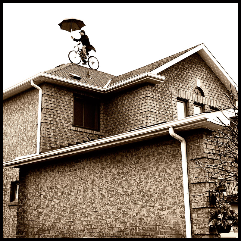
I replaced the shingles on the house across the street today.
So cool, all my stuff was in my studio. I asked for a volunteer from the crew.
Hey who wants to update their facebook photo?
You may recognize the bike from my Quite Perplexing shot from a couple of years ago.
Hope this does well :)
Thanks for looking
Cole
Post
This is awesome!!!
Thanks to all for the nice comments and votes
Also thanks to Scott for braving the high wind on the Bike
and Zoran for helping with the setup.
Cheers
Cole
Statistics
Place: 2 out of 109 Avg (all users): 6.9593 Avg (commenters): 9.1111 Avg (participants): 6.5000 Avg (non-participants): 7.2152 Views since voting: 2538 Views during voting: 281 Votes: 123 Comments: 31 Favorites: 1 (view)
Hi Coley. With a score of 6.9xx and a placing of 2nd, not too sure what I can say that the numbers don't already say.
I'll start by saying this really is a fantastic image. Incredibly unique and creative and clearly this resonated with the voters. The composition is strong, the processing with the toning is nicely done, and the execution is great. Where this image fell short for me, though, was the exposure and focus. The building is perfectly exposed, which is important considering the proportion of the frame it takes up. However, the bike and the rider are a touch over-exposed, and there's a loss of detail there. I can't see the front forks, handlebars, spokes etc or the umbrella shaft. Not sure if this was from the exposure of the picture itself, or as a result of the processing required to turn the sky white? Since the challenge was all about "bikes", I felt this lack of detail in the bike itself was a shortfall. Likewise, while the building is exceptionally sharp (those bricks are killer!), I found the bike and biker to be quite soft, with little definition and detail in the bikers face.
Clearly, these "criticisms" didn't impact the voters at all, and the image score highly as to be expected. Hopefully my viewpoint has some merit and the critique provided something worthwhile for you.
Feel free to PM me if you'd like to discuss anything I've written about!
Whimsical and quirky - very much the style of...Coley!!!:-) Love the quirky whimsy of this shot. Technicals and PP are well done but there is just one thing that I felt would have made this shot a 10 instead of a 9. I think there is too much house and not enough attention focused on the main subject riding the bike. I think a closer rectangular crop where the line of the lower roof is coming out of the bottom left corner would have improved the composition. It would have given us a much up close and personal view of the Roof Rider and shown off alot more details on your main subject.
Hmmm... umbrella, hat, coat, excessive creativity ;) ... must be Chrystyne. I'm not fond of the border and would maybe have preferred the lower third or so cropped, but what a creative take on this challenge. Well done! (and if this isn't Chrystyne, that was a compliment!)





 Off The Beaten Path
 Add photograph to your favorites
 Add photographer to your favorites

 Photographer found comment helpful.


