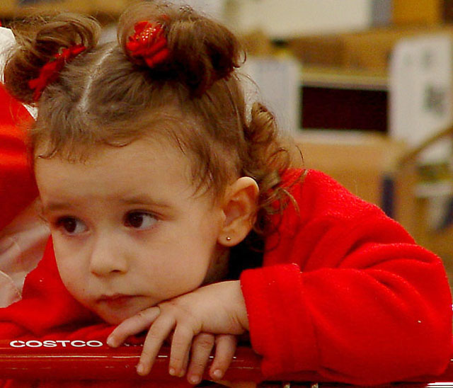
Initial thoughts Beautiful color, great expression, seems a bit grainy
Composition/ Content
I am really surprised this scored as low as it did. I assume that folks didn't get the connection to the challenge. I felt that the little girl in COSTCO was in a place that she didn't want to really be, thus the look. The red in the shot is great, I like the way it all matches the handle on the buggy. I think you may have improved the composition a bit by making it a portrait instead of a landscape. If you cropped it just left of the black box in the upper right you still would have her and the expression and the handle. I think it may have improved it some.
Background As mentioned it is just a bit busy. May have been better cropped out.
Camera Work - Technical Focus is good and the lighting really good for a shot in a store like this.
Digital Processing - Technical Here is where I think you could have really improved the shot. I mentioned the cropping but the biggest thing is that you only used 72kb of the 150kb allowed by the rules. The additional pixels would have really sharpened this shot up. I think there may be a few jpeg artifacts as well.
Fits The Challenge After a little thought it fits the challenge.
My Opinion On The Photo I originally scored this shot a six which was on the high end of the voters. I think that it meets the challenge but could have been improved a little to finish even higher than it did. Good job, and keep up the good work.
I would be happy to talk further about this shot if you would like to contact me.
DougPaz
After seeing the Costco logo, and thinking about this from the childs perspective I think this fits the challenge perfectly. The dark rectangle in the upper right hand detracts from the image.
This is a nice shot, but I don't uderstand the theme and how it fits into this challenge... there doesn't seem to be anything 'strange' in or about the image.. .- setzler






 Add photograph to your favorites
 Add photographer to your favorites

 Photographer found comment helpful.


