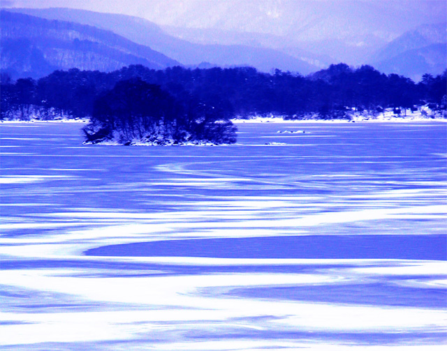
Took loads of snow pictures for this challenge and played around with the bracketing for snow a lot, finally settled on +1.3 EV to get the snow as white as possible. Then boosted the contrast and added a blue tone.
Statistics
Place: 88 out of 188 Avg (all users): 5.3447 Avg (commenters): 6.6250 Avg (participants): 5.3186 Avg (non-participants): 5.3763 Views since voting: 1248 Votes: 206 Comments: 21 Favorites: 1 (view)
COMPOSITION
The composition of this is very strong, I believe. The patch of trees, or whatever it is, gives the eye a strong place on which to rest. Also, there is "movement" in the picture created by the blue streaks. Also, the mountains fading into the upper part of the frame is very nice. The only suggestion I might make is a more narrow crop so that there is less foreground.
TECHNIQUE
I'm curious as to why you took a lot of pictures to get white and then added a blue cast. Did it help make the blue/white contrast more distinct? Under any circumstance, it is well done, as I understand snow shots are among the most difficult to take. My biggest concern is that there seems to be a lot of noise/graininess especially in the background. A blurry background is especially effective, if there is an object of interest in the foreground that is pin-sharp focused. That object of interest is not in this picture. The closes thing would be the "island" on the left, and it seems to be kinda soft focused too. I almost suspect, the graininess may have come about with the boost in contrast.
OVERALL EFFECT
This shot is COLD and QUIET. It looks frigid, partly due to the snow and partly due to the blue cast. It also looks very lonely as there is nothing but nature there (isn't that wonderful?) and again I think the blue adds a "solitary" feeling to it. Very interesting shot!
Wild looking landscape, I am assuming you altered the coloration some, right? You picked a very difficult song to portray, but you did it pretty well. Score upgrade from 6 to 7. Swash
Don't like the blue. Can't tell if this is sand, snow, water, etc. Looks like it might be a really beautiful photo in natural color. All I can give is a 1. PTL
I think this is very well composed and well balanced and would work equally well in many other colours. Does the oversaturation of blue bring the dark woodland forward? I just wonder whether it would have been possible to emphasise the space in this scene a bit more by adjusting the colour. Just a thought, but I really like it.






 Add photograph to your favorites
 Add photographer to your favorites

 Photographer found comment helpful.


