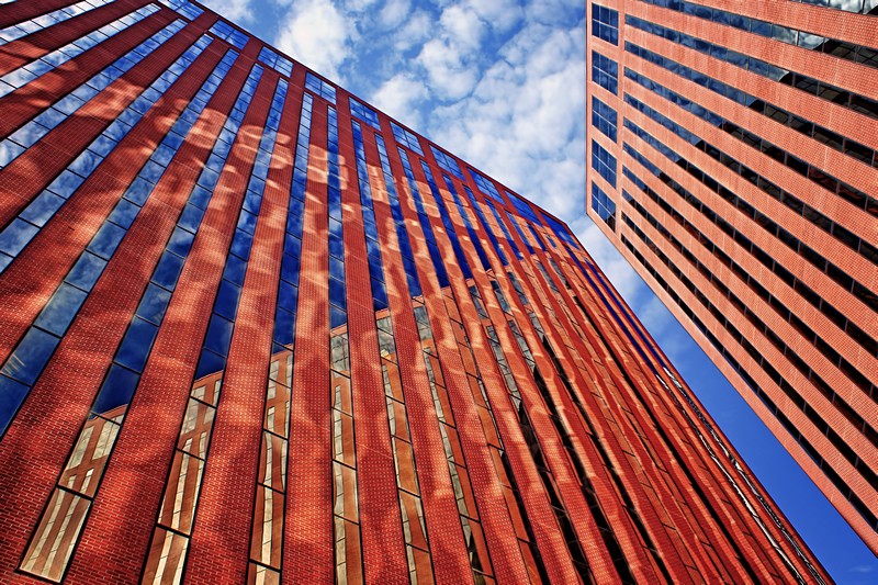
The leading lines lead to the sky & I don't see the sky as 'nothing,' so I don't have a problem there. I like the primary colors, which flatten the detail, turning the skyscrapers into cartoon facades. I'm going to guess that the 5-and-below scores were for the primary colors, if for no other reason than that they are not literally realistic.
I love the color and the play of the reflected light off one building onto the other...
On it's own, I actually like the framing of this as well, but in this particular challenge, I'm guessing you lost a few folks who didn't think the lines were "leading" to a subject. Another crop with more accent on the sky above (placing the point where the tops of the two buildings are closest) in the lower third might have led the viewers to see the dreamy clouds as the "subject" your lines "led" them to...





 Add photograph to your favorites
 Add photographer to your favorites

 Photographer found comment helpful.


