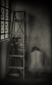
Good idea, nice pose, good use of filling the frame; the saturation looks a bit too strong on the blues and cyans, there's an odd patch of blur under the right arm too that's a bit distracting. Did you do a bit of warping or liquify? Some of the edges near the blur look a wee bit untidy.
Love the idea here, and pretty impressed with the photography. I wish the model looked a little less posed - and here I am looking specifically at the left hand. Something about the positioning gives a slightly strange look to the right flank, but apart from that, an impressive entry.









 Add photograph to your favorites
 Add photographer to your favorites


 Photographer found comment helpful.


