Thanx Betty and James for your nice comments and also Justine for your critique.
As written by me before, I'm very happy with the result and when I look at the Top 10 I don't feel my picture would belong there. And being on place 11 or 28 does not matter much to me. As jusitne said: it was a strong and fun contest. And my submission did a lot better then I thought!
CRITIQUE CLUB
Hello Harz_Joerg
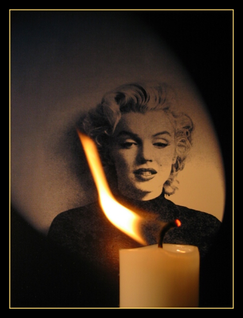
Composition/Content:Impressive shot with impact. The crop and framing is very nice and the topic fits the challenge...well the song too!
Lighting:Looks very good with the colors you've used.
Background:Very nice
Camera Work/Technical:I think the soft foreground would of been better if the focus was a little stronger. Maybe if they were reversed with Marilyn in softer focus.
My Opinion:Very nice shot, I like it and thought it would do better. This was a strong challenge with many winners IMHO.
Thanx for the many nice comments and for making it the best candle shot!
This was more or less a last chance submission, I wanted to do something different on the last day of the challenge. Didn't find the time.
I was also pretty sure that this woudn't be the only submission and that people would vote the picture down after they already looked at several ot them. So 28th place is great and I'm very happy.
This was acctually the 16th shot after everything was set right. I couldn't get a nicer flame in the 80 shots afterwards.
Thanx also for the comments on the border: the color is from the flame, but from an outer part, not from the brightest region. A darker inner line could is nicer though, tried it later.
I realized that the flame didn't illumnitate MM correctly (see comment of johnny) only after the submission. However, it wouldn't have worked with the flame covering the bright part of the MM-picture. So I was lucky.
Good representation of this song. I like the "spotlight" on the photo, nice touch, as is the flame blown to the left. Well thought out. I try to not compare photos, but since there were so many on this song, I thought I'd tell you, this one is THE best interpretation. (is that fair?) 8 Swash
I really like this one. About the only drawback, for me, is the light line of the border. It is brighter than anything except the hottest part of the flame, and it imparts a rigid frame to a picture where everything else is soft curves fading in and out. The flame is is a bit washed out at the center, but I don't know if you could have done anything else. Over all, contrast is excellent, lighting and exposure are excellent. I like the way you handled the picture of Marilyn Monroe. The way the flame curves to reveal and frame her face is great. Even without knowing the words to the song, the picture graphically demonstrates that she is indeed the candle in the wind. While I have mentioned a few drawbacks, the rest of the photo is so powerful and well done, that I am still going to vote it a 10.
Very nice. Although I know it's probably not the most important part of the photo, I think you use of borders on this photo is the best I've seen so far. Good job!
Ace, love the composition. The portrait of MM in the background makes this the best candle in the wind shot. I rate it high (yep vote high) on the composition alone. The candle in the foreground is a bit to soft, but that could well be an aperture decision to allow a fast enough shutter for the blown away flame. I like the lighting of the portrait. The frame is also in balance with the pic itself.
Looking at MM herself, I like the left side of her face the most. :)







 Add photograph to your favorites
 Add photographer to your favorites


 Photographer found comment helpful.


