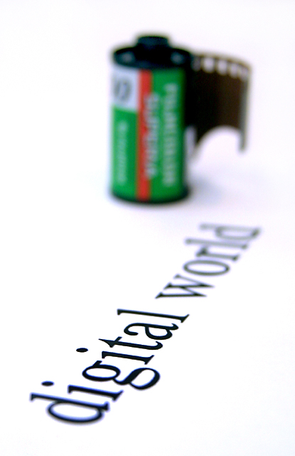
Arnit, greatings from the Critique Club! I did not vote on any of these images in this challenge and have not read any comments. So this is my first time seeing this and wow, this is a nice image. There are only a few comments I can make, and they will be small comments for sure. I might open up the DOF a little bit more. Even though I can read digital world, I would like it a bit sharper. I think if the type were sharp and the film canister blurry the symbolism might have been more impactful, especially if the canister were further back in the frame.
The shadows along with the blurred type in the image are turning blue. I took it into photoshop to verify that it wasn't my monitor and it is blue heavy. It has the chromatic abbrasion feel to it. Easily enough fixed though.
I wish I could supply you with better feedback, but I really like the image. The blown out background is nicely done. The idea is powerful. The green and red in the cannister stand out nicely. Great image...
If you have any questions or comments for me, just email...
I like this shot quite a bit, but I think you need a tad more depth of field to bring the first part of the word 'digital' into focus. I think that would have made this stronger and kept the film canister out of focus as well... nice work :) - setzler
Good idea. Just a thought...... it would have been funny to have someone trying to fit the film into the card slot of the digital camera. The D being out of focus is distracting to me but I like it anyway.
Great imagination for this simple yet effective shot. I love it when shallow DOF is used properly as in this shot (if only the DIG was also in focus I would've given you a 9). Your WB is very good too. 8
Great fantastic idea. But all of it needs to be in sharp focus. The roll of film is what is in the strange land of digital, therefor it is what need to be in focus. With the way you have it it appears, to me anyway, that digital is strange and the world is the roll of film. Think about it a minute. I could be wrong. But I really do love the unique idea. Your idea is a 10, the photo quality is only a 4 at the most, more like a 3. That would be an average of 6 - 7, which is actually more than the photo itself should get on it's merits. But this is just how I see it. Has good potential with just a little change. PTL. Could be a 10 overall.





 Add photograph to your favorites
 Add photographer to your favorites


