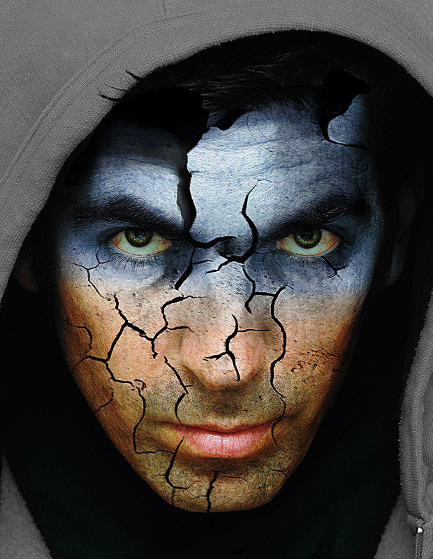
Well done. One of my top picks. I might have gone with more of a dead flesh greenish gray shade of blue than your brighter cleaner shade, but that is a minor issue.
Interesting take and it does seem to reflect "Falling Apart" however the processing (while well edited) is a bit unbelievable in the sense that the "crackle finish" appears to be an overlay instead of being a part of the actual contour of the man's face. In that case it could be a "painting that is falling apart" but as it's not doing so in the hoodie area -- just his face -- I don't believe that's the intent.
He's also not reacting at all to his face falling apart, so that kills the effect for me.







 Add photograph to your favorites
 Add photographer to your favorites


 Photographer found comment helpful.


