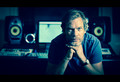
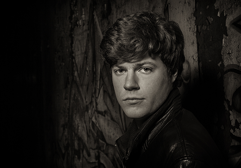
Given another opportunity, I'd ask the subject to tilt his head left or right, putting one side
of the face into some shadow a modelling light technique to help emphasize bone structure,
facial character etc.
i scored it a 7, i thought it was well lit, nice pose, catch-lights in the eyes, interesting but not overpowering background.
unfortunately, its boring. portraits are very hard to garner mass appeal. you do this with a very interesting subject, a very, very photogenic one or compelling light or pose.
you nailed this portrait of this person and i'd be very pleased if i were a paying customer, its just lacks the mass appeal to get high scores.
I liked the focus and composition. Lighting was a little flat for my liking. If that was a little more dramatic, I would've scored it higher than the 6 I gave.
I didn't vote on this one, probably would have given a 6. I like the background and composition, focus is spot on, tonal range is very good. Overall good portrait, just nothing special. I find the lighting to be quite standard-ish and uninteresting.
You might feel different, but your biased - I don't get an emotional response from this portrait, there's neither drama nor happiness conveyed; it looks like what it is - staged.
That was my sentiment and I did give it a 6. I thought about changing my vote on this one more than once, but ultimately left it at 6 for the reasons stated by H2. Everything about the portrait is technically very good. Both the subject and the expression were just boring.
If there had been any quirkiness, grit, laughter, unusual pose, I would have likely scored it higher.
I didn't vote on this one, probably would have given a 6. I like the background and composition, focus is spot on, tonal range is very good. Overall good portrait, just nothing special. I find the lighting to be quite standard-ish and uninteresting.
You might feel different, but your biased - I don't get an emotional response from this portrait, there's neither drama nor happiness conveyed; it looks like what it is - staged.
I didn't comment on this one during the challenge because it was one of my favorites and I thought it would be near the top. I only commented on ones that missed the mark for me in some way. This is a prime example of a a score that should be higher. I can't comment on improvements because I like it the way it is. But in trying to understand why others didn't score it higher I would say that overall it is dark and some people might not like that. I did though.
This is a great portrait, sharp right where it needs to be, great light. And the model reminds me of the young Luke Skywalker from the original Star Wars movies (//en.wikipedia.org/wiki/File:Luke_Skywalker.png).





 Add photograph to your favorites
 Add photographer to your favorites

 Photographer found comment helpful.


