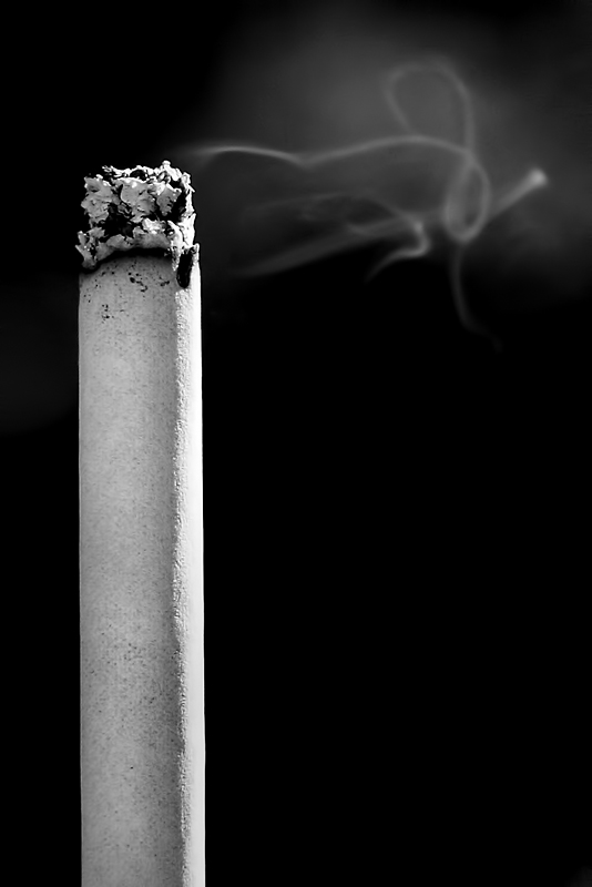
Was this a mistake of orientation? This portrait format gives it an entirely different meaning to my eye - the smokestack of an aging industrial plant corroding itself and the air around it. Good idea with options.
The cigarette itself is aces. The texture, the height, everything on it works. The smoke, albeit real I'm sure, looks fake to me. Like you took the pen tool and did a bit of a scribble. It distracts and it's supposed to be the star. Had the theme just been "Smoke" without the description of "where smoke plays a major role" I'd have scored this higher, because a cig is "a smoke" as well... but the description makes it clear that the burning smoke is what is to be the star. Anyway, it's still a great shot and it includes smoke, so I'm not saying DNMC, just that it could have been stronger. IMO.





 Add photograph to your favorites
 Add photographer to your favorites


 Photographer found comment helpful.


