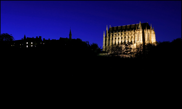
This is a photo i`ve been wanting to take for a while and this challenge gave me the incentive.
Just cropped a little and adjusted levels/hue,saturation.
I would have liked the lighting on the building to be more even and less trees blocking the view.
Predicted score 6.3645
Statistics
Place: 67 out of 69 Avg (all users): 5.7698 Avg (commenters): 6.1667 Avg (participants): 5.7167 Avg (non-participants): 5.7791 Views since voting: 1839 Views during voting: 779 Votes: 404 Comments: 53 Favorites: 0
I tried to take a similar shot the other day, but more towards the Sussex Pad, there are less tree's in the way there. Would have been good if I had had a tripod with me:-(
Nice night shot. I like the way the building is lighted up to be the main focus. It would have been great to see all the building but you would have to cut trees down. LOL I do find the lights in the house a little distracting from the pic. Maybe black them out. Nice work and good luck. 6
Royal blue, gold and lots of black. Its awesome. Listen carefully- do not let anyone tell you there is too much black. Maybe the tree obscures the gold alittle, but its great.
I think this photo has too much negative space in the foreground to be 'strong'. The exposure is nice, but there is just a bit too much 'nothingness' in the composition...
Rule of thirds works well here, and I like the light on the building and in the sky. I'd like to see more detail in the black, black foreground, though. Interesting subject and great idea.
Lovely lighting, interesting blue sky. Almost seems unnatural, but I'm sure that's very close to how your camera caught it. The lights on the left are a bit distracting, but I don't know if there was something on the right that was even worse. I wonder what a vertical layout would look like. Looks like this shot used a slow shutter speed, well done.
Magnificent building. I would've cropped the black area more tightly - make it more panoramic - or leave more of the sky. The sky colour is so intense. I wonder if it's an original colour?
The blue sky and building are truly superb. The bottom half of the image has no detail at all. It may be better with a lot cropped off the bottom, making it into a slim Jim format.
Really vivid colors on the sky! Foreground seems quite dark. Seems like there are some heavy shadows falling on the building which break up the lines of the architecture.
I like the lighting on the building and thre dark, rickly colored night sky. I think you could have cropped out more of the silouetted featureless foreground though.
this image is very nice because the composition is very strong. However, the lack of clarity does not offer the reward the eye looks for. The beautiful blue sky contrasts well with the zone 1 foreground. But the center of interest does not sing. despite all this the general feel us smart and very attractive. 6
It certainly looks beautiful -- especially against that royal blue sky. I know hard it is to do, but I would have loved to see a little more definition in the foreground subjects -- not quite so darkened out. But it is still a great picture. 8
I really like the blue sky vs the lit college. But I think you've got too much negative space on the bottom, it overpowers the rest of the image. Taking off about an inch of the black space makes this a much stronger shot, imo.
A very nice shot but the negative space on the bottom hurts this shot more than helps it to me. Too much black for a dark night shot to start with. I would have liked to have seen the building take more of the shot , it looks like a wonderful subject. A 6
This is very nice, and the sky is just spectacular, but I was hoping for more of a stark silouhette with the buildings on the left. Their lights really do distract from the intense lit-up-ness (should be a word!) of the college... very nice shot, though, thanks!
Nice time exposure. Maybe a little to much black at the bottom, try cropping a little tighter. I think this shot might benefit without the lights from the other building. Just a suggestion. 6
Good capture of the cathedral (?), nice silhouette as well on the left. Both together, I find confusing and the big black empty space does not enhance it, in my opinion.
Excellent night shot and the College is illuminated quite nicely. I rather liked the silhouette in the right half of the image but not sure if the lights in the buildings were cloned out if it would look better or not. As negative space goes, your image closely adheres to the rule of thirds but I think it would look better with more sky vs empty black. 7
Nice colours here, and an interesting building, but the overall composition and use of silhouettes is not quite 'clean' enough for my taste. Perhaps a panoramic crop might have suited this better. It's a shame the treeline in front of the college isn't more simple. 6
I think this is an interesting shot. I like the way the building is Illuminated, however I would've reduced the frame to exclude at least the buildingwhere the windows are lit up. 6
This is a good picture but its not special. The building is not very sharp. I think I would have liked it better if you had gotten closer so the viewer could see more detail and this extraordinary building was more of the picture. The rest of the backround and foreground are interesting from a negative space point of view, but IMHO it takes away from the picture.
Beautiful college and the blue of the sky is outstanding. I wonder if a bit closer crop wouldn't have worked even better. THe lights on the building on the left almost draw me away from your focal point.
I think there is too much black in the photo. The blue of the sky is really nice, and the college looks very impressive, but it's just a bit too far away to appreciate fully. I would have cropped in tighter on that. 6






 Add photograph to your favorites
 Add photographer to your favorites

 Photographer found comment helpful.


