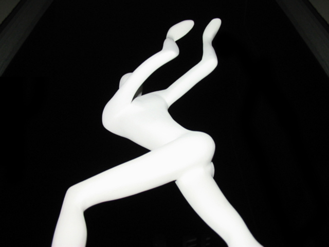
Composition/Content: Very nice framing of the figurine and nice choice of subject. Nice use of white against black for a simple but striking image.
Lighting: The flash accentuates the contrast and maybe too much. Flash sometimes "flattens" out an image. I think reflected light or side light would have given this figure more depth and because of that more life. I would have still made it high contrast just different angle on the light.
Background: The upper corners are slightly distracting because they are the only things in the background that aren't black.
Camera Work/Technical: Excellent camera angle.
Digital Processing: I've seen some of my images have the gradients like the upper corners here, and they were caused by over processing the color levels and/or saturation. I don't know if that's what caused your gradients or not.
My Opinion: I like the image and think it is well done. I don't think upper corners were the reason for an average score. The image is striking but could use more depth with different lighting to make it more three dimensional.
Cool shot (of someone else's art, I have a slight problem with that). The walls/beams/columns on either side seem sort of distracting. Very strong contrast (I like that!) 6 Swash
Yargh, I am sad that you offered free publicity for this subtly racist song! I know that now it's part of our popular culture, but it's offensive to Egyptians... who walk just like everyone else. Your photo is interesting in it's own right, but I wish you had chosen "Walk This Way" or something else as your song.
Just too funny, the statue sure looks like it is doing the dance. I wondered about the diagonal lines at the corners. They don't hinder much but don't help either. I like the contrast of the white with the pitch black background. 6.
Take my comments for what they are worth for I am just a novice with a new camera. Dodo






 Add photograph to your favorites
 Add photographer to your favorites


