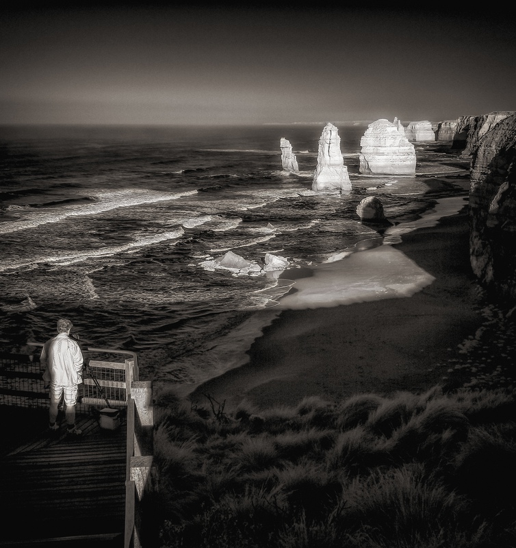
I thought about more contrast with less detail in the RH bottom corner and heavier vignette but I think this version will score a bit higher. I will post a higher contrast version on 500px once this challenge is over.
Statistics
Place: 10 out of 205 Avg (all users): 6.5143 Avg (commenters): 7.6923 Avg (participants): 6.4730 Avg (non-participants): 6.6129 Views since voting: 1378 Views during voting: 189 Votes: 105 Comments: 18 Favorites: 1 (view)
Great light and stunning in black and white. I often like the addition of a human element into a landscape, but here I think the patterns of the light on the wave caps and the striking apostles themselves would have carried the scene. I'd at least look at a horizontal as an alternative. Voted earlier.






 Add photograph to your favorites
 Add photographer to your favorites

 Photographer found comment helpful.


