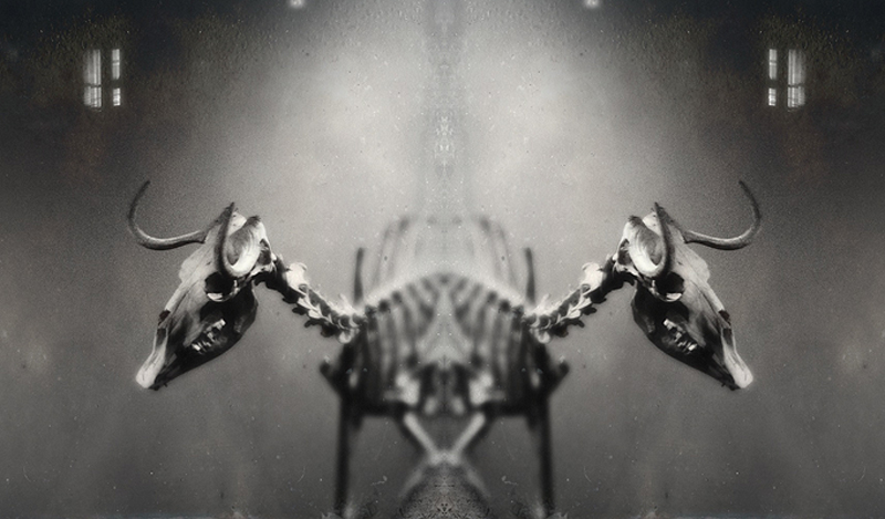
This is one of those images where a reviewer can be a real ass or can be honest in evaluating it's merits - a good news, bad news kind of thing. So, the good news is that from an artistic standpoint, it is a very good composition. From a technical standpoint, it doesn't quite make the grade. The juxtaposition of the two skeletons is flawed at the bottom and top of the image which creates a false impression of sloppy post processing. I know what the author was trying to convey, but it just doesn't work - for me that is. Others may differ. But to be fair, it's worth a 7 because of the effort to create it and it's artistic merit.





 Add photograph to your favorites
 Add photographer to your favorites

 Photographer found comment helpful.


