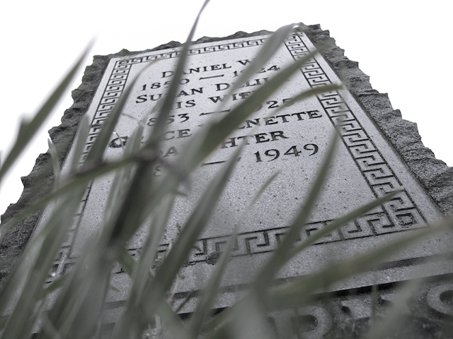
I took this at a nearby cemetery. My intent was to capture an image which was both a metaphor for transition as well as containing visual transitional elements. In PS6 I cropped a bit, reduced saturation and changed the white point.
Statistics
Place: 21 out of 104 Avg (all users): 6.0887 Avg (commenters): 6.8108 Avg (participants): 6.0366 Avg (non-participants): 6.1240 Views since voting: 1330 Votes: 203 Comments: 41 Favorites: 1 (view)
Thanks for the comments all. Very much enjoyed and appreciated.
Yes, yes, when I saw the 'Ground Up' challenge after posting this pic, I thought "Crap! I know what most of the comments are going to say!'
Some public responses to a few of the comments (not that anyone really gives a hoot)...
I did not think the grass would annoy people as much as it did. The intent there was, as Terrentius nailed it, to give the perpective of looking up at one's own headstone. The Grass also provided a way of obscuring some of the text, which I believed added an element of mystery (good call Gordon) and also helped to frame the date which, as reflected in the title, is the reference to the transition theme - the year this person passed away, transitioning into another state.
Ahh well, maybe I thought about it too much...
As for the 'cutout' sky, this picture was taken on a typically overcast and grey Washington day. That caused the sky to be pretty washed out to begin with. After desaturating, I adjusted the white point so that the sky was a clean white.
My only concern with this is that it has been cut out but it could be because of a cloudy white sky. Anyway, I really like the pic, it would work for the current "from the ground up" challenge too.
I like what you've done with the blades of grass, though at the same time they're a bit distracting. Maybe focusing on the grass and not the tombstone would've made more of an impact -- but then you'd lose your transition...hmm.
did you realize there is grass in the photo...but seriously it hurts more that helps i think because the grass becomes the focal point, and the grass is blurry, and it is blocking the stone
The stone is composed very nicely. I don't like the grass though. Are you going for a "raised from the dead" look? The grass is more of a distraction then a help.
good attempt at an unusual angle - you could re enter it for the 'ground up' challenge :) Grass is a bit too heavy I think though, would have been a good frame but obscures too much in my opinion, though it does add mystery by hiding the names.





 Add photograph to your favorites
 Add photographer to your favorites


