Greetings from the Critique Club
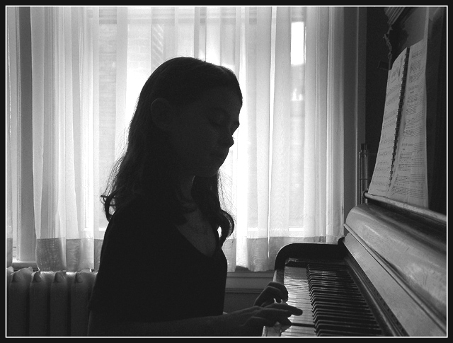
I have to say I really enjoy looking at the picture. I think if I made one suggestion it would be to have her face showing more detail by keeping the silhouette. I guess the easiest way to accomplish that is by have her had turned more towards the center of the piano.
There's some needless space behind the girl. Try cropping that out for a tighter look.
I think going with b&w was a good idea and I also think the lighting is almost perfect. Just the area around her head seems a bit overexposed especially the side where her face is. Great photo. Sorry it didn't do better. E-mail me if you have any questions.
normally pics people's children don't do much for me, but this is really nice. just enough face on her silhouette, nice gleam on the keys. and you can see the staff on her music, this is really nice.
I'd have turned her a little, maybe added some hair curls, hunched her shoulders, and made it more a pure silhouette -- I think it would then look quite similar to the familiar Beethoven profile..
The strong light from the window has made the subject too dark in comparison to the rest of the image. Spot metering of the piano player would of improved this picture, if that is possible with your camera. jgillard6
Neat sillhouette, but I would have preferred either seeing some facial features or pure sillhouette. This leaves wanting to see more of her. I do like the pose. Very cool. It might have been cool from behind, too, showing the sheet music and her hands. 5 Swash
I don't know if your intention was to underexpose the subject or it just happened that way. If it was an accident, to correct the situation you either overexpose the subhect, or move your camera in until the person fills the frame, take an exposure reading and move out. Either way, I think iy would have been nice if it was exposed a little more so we can see the person playing it. Still a moody photo, good shot.
Too much space in the top left area, and thers a bright patch in the sky out the window. Not much you can do about the briight patch. The levels on the kid is just right, its not quite a silhouette and you can see the concentration if you look hard enough.
I think the girl is either too dark or too light. I can't decide if it's supposed to be a silhouette or if it's just a dark photo. Other than that I think it's a good picture, good idea to choose a classical piece. Good lighting except on the girl. :)
i might have tried to crop out the music to end the right side with the key board. much more intimate that way. nice contrast between curtains and the dark silouette. 6
More facial details would be helpful. I don't think necessary, but I know I would like to see them. The rest of it is really well framed and composed. - Inspzil







 Add photograph to your favorites
 Add photographer to your favorites

 Photographer found comment helpful.


