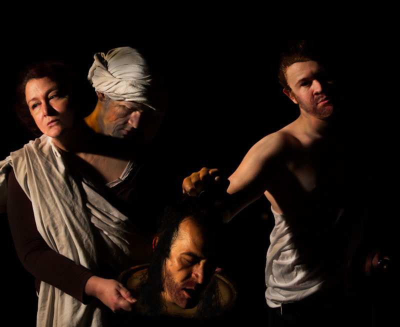
Heavily edited. This looks awful, but I posted anyway. Chiaroscuro lighting, I discovered, is not really natural. Wound up taking multiple photos with different lighting and pasting together.
Let the thrashing for bad Photoshopping begin.
[Feb. 2nd, 2013 10:10:07 PM]
I am shocked that this is doing so well. At least for me. I did not expect this to do better than mid 5's. Wouldn't have been surprised with below 5 frankly because of the many issues with the reproduction.
The comments are very interesting.
This is my attempt at Caravaggio's painting of the same name. This is my wife, myself and my two oldest children. They were very patient with me.
Statistics
Place: 6 out of 38 Avg (all users): 6.3881 Avg (commenters): 8.6000 Avg (participants): 5.8696 Avg (non-participants): 6.4955 Views since voting: 2279 Views during voting: 352 Votes: 134 Comments: 13 Favorites: 1 (view)
This deserved much more, you shouldn't be happy with this score. Unfortunately a lot of people don't know the famous painting and this thing didn't help you - I'm sure of that :)
Congrats on the tt. This was a very ambitious project, and you really achieved a wonderful result, despite a few technical issues. It is a beautiful, painterly tribute.
You should have made a reference to Caravaggio's painting so that everybody could appreciate the extent and quality of your work.
In my view, this is the only picture worth considering in this convoluted challenge that produced so many childish or kitschy images. A professional one.
You truly made a "tableau vivant" and there are parts totally remarkable, not to mention the chiaroscuro that you achieved. I don't think that there are good reproductions of the paintings, your scene is the closest to Caravaggio than what one can find on the internet.
There is just one unfortunate juxtaposition of the figures on the left side that truly exists in Caravaggio's painting also.
I particularly appreciate the treatment of all the draped scarves and clothing - you left it all painterly and did not succumb to the sharpening temptations.
I really like your use of light vs. darkness in this shot. Harsh shadows. Bright, almost too hot light. I also like the expression on Salome's face - it shows she really isn't into this "present", even though she asked for it.
Very painterly and dramatic image, although I don't understand quite what I'm looking at. Why does it seem that there's a man's head coming out of Salome's neck?
Such an interesting story to choose to illustrate. And I love how you used the dark tones to give this a sense of the dark mood of the story. It is interesting to see the emotions on Salome's face. In the story, she was portrayed as a real harlot, a wicked woman. And here you have shown that she understands the depth of her depravity after being shown the results of her wishes carried out. She is turning away, as if in disgust.






 Add photograph to your favorites
 Add photographer to your favorites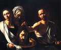


 Photographer found comment helpful.


