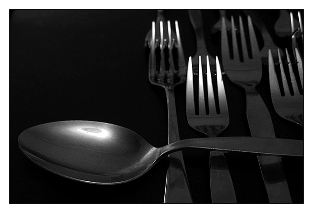
Overall a very well-done photo. The range of blacks-and-whites is quite good and I don't think the photo is either too light OR too dark. The polaroid-y type border is well-done and sets the photo off from the page quite well.
I only have 2 nitpicks. The first is the flash of light in the cup of the spoon. Unfortunately, it draws the eye to it and distracts somewhat. If there had been a way to soften that, it might have been better.
Secondly, I'm not sure about the composition. I like the way the forks are lined up so rigidly, but having the spoon draped across them makes it seem like just a random spoon thrown into the shot -- not like the spoon was sneaking in to the lineup when it wasn't supposed to be there. I don't know what your intent for this was, but I'm wondering if it would have been more effective to have the spoon stuck in a row of similiarly-placed forks instead? Wonder if you tried that, or were just going for something different.
doesnt seem to meet the challenege... feel free to email me and explain, as otherwise it's a good photo.. seems more like an ordinary something that's out of place rather than a strange something in a strange place
This seems too dark overall, yet too light in places - a tricky effect to achieve! I think the light needed softening, or bouncing to even it out across the scene a bit more.
Not a bad shot, composition is good, and I like the angle you've shot it at.







 Add photograph to your favorites
 Add photographer to your favorites

 Photographer found comment helpful.


