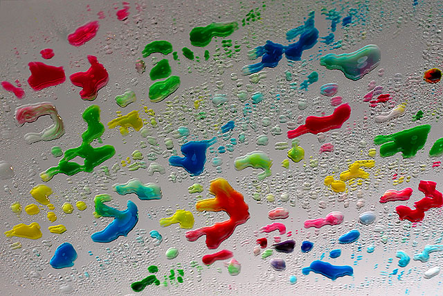
Place: 107 out of 140.... not good.... like this picture like an abstract for of art... maybe too abstract... maybe a nice background for something !...thanks for all the comment
Excellent idea, but the execution is weak. Because of the angle you chose the image appears to be uot of focus or accidentally doubled rather than using a mirror on purpose. Next time consider using a thicker mirror (which will separate the reflect from the water colors even farther) and alter the angle. Work on your focus and exposure as well.
love the colors. not wild about the lighting. even though this is an interesting image, it could probably use more context to make the mirror more evident.
Love the creativity shown here. Colors are very vivid and well saturated. But for some reason, I get dizzy trying to focus on this image. There doesn't appear to be a main focal point and in some areas I actually see double.




 Add photograph to your favorites
 Add photographer to your favorites


 Photographer found comment helpful.


