Well, personally, I have never heard of the song or the band but I would say it definitely meets the challenge.
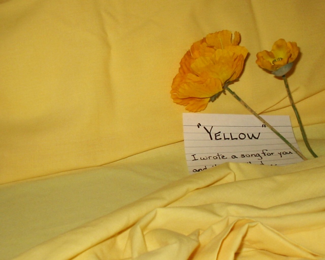
Composition is ok, I think it could be improved by making the flowers stand out a little more. They seem to be kind of added in and not really part of the scene. Perhaps lay them down.
The card is kind of odd. I can see what you were trying to do with it but you cut off the bottom line and since everything else is yellow a yellow card or perhaps a post-it note would have been more appropriate.
I definitely like the bunched up cloth to give the image depth and the curves. Good use of diagonal lines to bring the viewer's eye towards the card and the flowers. But I think there's also too much negative space in this photo.
Overall I think it's a good photo but there's definitely some room for improvement. |







 Add photograph to your favorites
 Add photographer to your favorites


