This is a new comment series for me, so please bear with me while I find my style!
(Voted earlier)
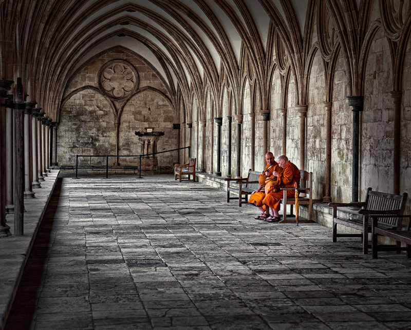
This is one of my 8s - I like it quite a bit. Furthermore I think it enriches the DPC collective portfolio. Put simply, I wish we saw more stuff like this. Let me tell you why it pushes all the right buttons for me:
1. This is really nicely produced - the leading lines (I appreciate the intersection with the bottom left corner too), a focussing vignette (though a smoother transition might work better) - well made choices these.
2. The coloration of the image - the bright orange robes offsetting the grey floor.
3. Your distance from your subjects - appropriate for the image and the context.
Overall, an image that resonates well with itself. |








 Add photograph to your favorites
 Add photographer to your favorites


 Photographer found comment helpful.


