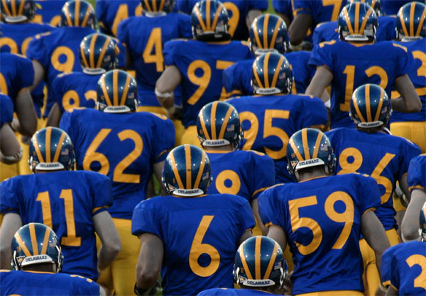
University of Delaware vs Towson University, UD taking the field here. It's actually the 2nd game i've gone to, and i'm a jr this year. Shot with my cheap Sigma 100-300mm. Edits are, a pretty major crop, Color saturations/hues, and overall adjustments of the same.
Statistics
Place: 6 out of 138 Avg (all users): 6.6748 Avg (commenters): 8.3333 Avg (participants): 6.0366 Avg (non-participants): 6.8893 Views since voting: 3088 Views during voting: 516 Votes: 326 Comments: 33 Favorites: 6 (view)
Sorry, my prediction didn't come true. It really could have been higher but top ten is not bad. But look at it that way, 24 people gave this a ten, certainly far more than the others in the top ten column received (except the blue). And looking at your scores so far ... you're showing a lot of improvement ... a ribbon is not far away. Hope to see more of your work!
I like your bio statement, "Tear my photos apart, I'll do it to others." I think that's a good attitude to have around here.
Well, I finally got a chance to look at this photo on my Nokia monitor. Although the colors do look a little brighter on this monitor, I still think they look a little subdued. Just for the heck of it, I opened the image into Photoshop and ran Auto Contrast on it. I think the result gave it a bit more pop.
I'm sorry I didn't get a chance to give this a second look during the voting. I gave it an 8, and probably would have bumped it to a 9 or 10.
Anyway, congratulations on your top-ten finish. Great photo!
An interesting take on the challenge. On my monitor here at work (21" Viewsonic G810) it appears to be slightly under-exposed. The colors look a bit dull. Increased exposure or a levels adjustment might have helped. I'll have another look when I get home tonight. My Nokia monitor is much better than this Viewsonic. If it looks better on that monitor, then I'll bump the score up a bit.
There are a FEW images in this challenge that look artsy, and this is the best. I really like the sea of repitition with blues jerseys, orange numbers, shiney helmets with their rising ray pattern - it's really great. Detail gets just a little fuzzy on one helmet toward the top where the action wasn't quite stopped. Good luck in the challenge.
I like this one a lot! I like the repetition and the simplicity of it all. In a way, all of these random numbers remind me of scary math class dreams I've had!
That's a very intimidating sea of blue and gold. This is the only shot I've seen with everyone facing away from the camera that I actually like. It's a very nice capture and a well composed shot. Good job.





 Add photograph to your favorites
 Add photographer to your favorites

 Photographer found comment helpful.


