I understand your challenge interpretation here quite easily and I'm familiar with the song as well :)
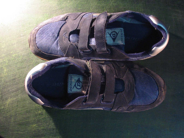
The perspective you chose here could possibly be improved. The image doesn't carry a good sense of any 'depth' to the viewer. A lower camera angle would give a much better sense of depth here I think.
Compositionally, diagonals are usually more impressive as well... if you rotate the camera counter clockwise about 30 degrees, some nice diagonals would appear here :)
I thought his shoes were more "fancy"? Funny, but I can't see this scoring hugely well. Technically good, but low interest factor, title withstanding. 6 Swash
These look more like "purple suade shoes" than blue. The blue lost a little in the transition. I have a pair that look like that from wear. Good focus and cropping. I think for blue shoes I'd chosen a different colored background. that may be what caused them to look purple instead of blue. Maybe a soft blue background to intensify their color and lead you to them. Just a thought. Still a 6. PTL







 Add photograph to your favorites
 Add photographer to your favorites


