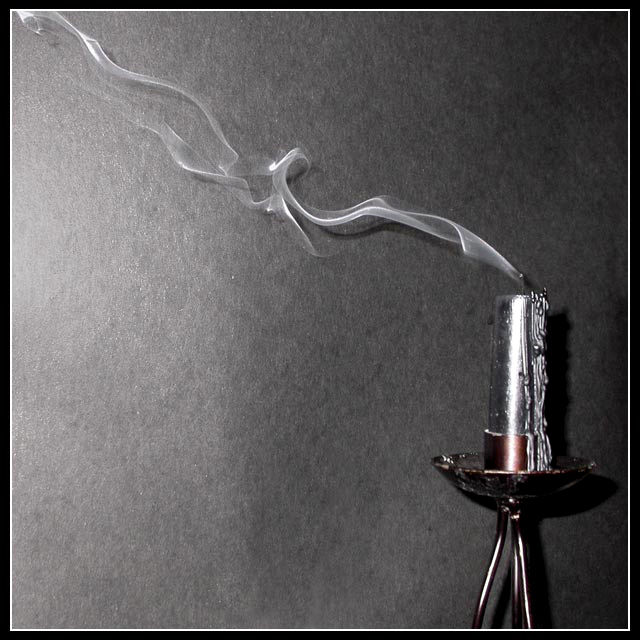
returning for comments. The only suggestion is that keep the background paper away from the subject, so that it doesn't lighten up and it looks black. the lighting should be from sides and not from front. Also you might like to crop the candle stand and just keep the candle top in the picture.
Nice take on the challenge and I like the use of space. Tthe smoke takes me away from the candle and the border helps me come back to it. Good use of lighting.
Nice focus on the smioke... Not sure if a plain background wouldn't help. Also completely desaturating would be better IMO, the red is a little distracting.
I'd have set this back from the background a bit, and then backlit the candle itself, rather than the wall - 2 reasons: 1) then the smoke would be going into darkness which would make for some really cool contrast and make you smoke stnd out more, and b) then you'd eliminate the shadow cast by the candle and holder. solid effort.
wow lovely use of lighting and composition, i would consider possibly making the red part of the candle holder just a tad stronger in colour possibly also removing the bright reflection of the light on the candle just for that added impact but over all great image!!
this is very lovely. the composition is very nice and the sharpness and detail of the smoke is excellent. colours are also a strong point - deceptively monotone, but isn't. i might have tried pulling the candle away from the wall a little bit (to reduce the proximity of the shadow), brought the candle a tiny bit more in focus, and to be honest, the border doesn't really improve the overall appearance. on the whole though it's a lovely shot, and the smoke is especially well done. it's also a very stylish submission. 7.





 Add photograph to your favorites
 Add photographer to your favorites


 Photographer found comment helpful.


