i see what you meant in the forums about you and your daughter disagreeing.
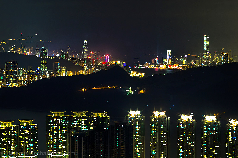
i quite liked the image. I think there are a few things i might have changed had i taken this myself (cropped about 5-10% more from the top so that the lights on the left give the impression of continuing on and not ending on dead space the same way), but i think it's a very well done overall image and the placement/score are representative of that.
the layers work well here, and i don't feel that it's underexposed in the middle - if there's no light there's no light... you can see the odd light in the zone which gives credit to the fact that there's "something" there, it's just not illuminated and adds to the depth.
The middle of the image might by a little too dead from a compositional standpoint as AP pointed out but could not have been avoided. It's a hill where a cemetery is located and.
The whites are blown through all over the image and that is very distracting. It might have been better to concentrate on one aspect of this rather than the whole.






 Add photograph to your favorites
 Add photographer to your favorites

 Photographer found comment helpful.


