I explored both at the time of shooting and in post processing things things that may have pushed this into higher position but love it just the way it is as for my own artistic purpose... thanks to everyone who voted and congrats to all who entered :O)
but yes in my hurry to upload i spelt the title wrong lolal even though my keywords were correct... thats what rushing does to you hehehe :O)
Statistics
Place: 7 out of 37 Avg (all users): 6.4067 Avg (commenters): 7.5000 Avg (participants): 6.3182 Avg (non-participants): 6.4219 Views since voting: 1140 Views during voting: 276 Votes: 150 Comments: 14 Favorites: 0
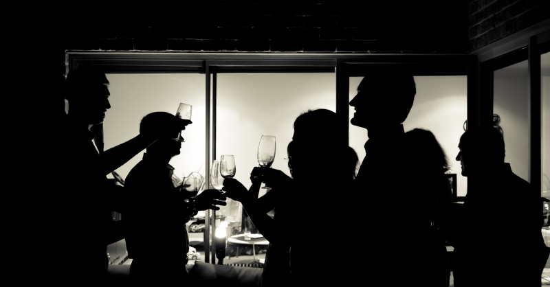
I like the idea behind the shot, the way the glasses are captured and the silhouettes that together tell a story. With a little more attention to composition (the arm across a face, the missing profile of h female in the middle, the cut off nose of the all gentlemen, a little tighter crop perhaps) this could have been a winner.
Thanks and i do appreciate the feedback :O)
I explored both at the time of shooting and in post processing those things you and others have mentioned here as well as other things and i discounted them purposely, for my own artistic point of view i much prefer it the way i have finished and shot it :O) but yes i couldve done those things and maybe it would have ribboned ;O)
I like the idea behind the shot, the way the glasses are captured and the silhouettes that together tell a story. With a little more attention to composition (the arm across a face, the missing profile of h female in the middle, the cut off nose of the all gentlemen, a little tighter crop perhaps) this could have been a winner.
Seasonal jollity is appropriate. Little things distract for me like the weird things above the head of the figure on the extreme right. I would honestly have actually cropped that figure out entirely as for me the focus of the picture should be the light area behind the glasses, after all it is the raising of the glasses in a toast that is the central theme of this picture and therefore should have been more central in the image. Cropping would also have helped with the slight lighting imbalance in the picture as it is with the right side being much lighter than the left which also draws your eye away from the action with the glasses off over to the right.
I think I would also have taken a moment to ask people to move slightly so as to remove the overlap between the three figures immediately to the left of the very tall man with the sharp nose. As it is it looks like one person with 3 right arms and a very odd head.
The lighting however in the central area and the darkness of the silhouettes is spot on.





 Add photograph to your favorites
 Add photographer to your favorites


 Photographer found comment helpful.


