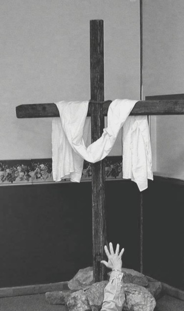
This photograph should be titled "Contrived." From the bad wainscoting to the horrible wallpaper border, this whole picture is awful from the word Go. I can't believe somebody piled up rocks in the corner of their house to photograph this. I'm surprised his trailer didn't start to list.
Did the black and white effect add to the drama any?
Initial thoughts Interesting composition, meets the challenge, focus seems a bit off
Composition/ Content
This seems to be one of those "almost" photos to me. You almost got a really good shot but just missed on a number of issues. As the commenters noted the background and centering of the cross are a problem. You explained why so you may have done the best possible under the circumstances. I agree as well that it may have worked better without the arm at the bottom. And that comes from a Holy Roller!!
Background Too cluttered and distracting. Especially the dark at the bottom and light at the top.
Camera Work - Technical Focus seems a bit soft. I don't know if that was on purpose but it doesn't seem to add to the shot. I would really like to see some more texture on the cross. It seems a little dark as well.
Digital Processing - Technical The first thing I noticed is that you saved the shot with only 38kb of 150 allowed. This in itself would help the sharpness of the shot. You may have been able to add a little contrast and brighten it a little in post-processing.
Fits The Challenge Definitely fits the challenge.
My Opinion On The Photo I originally scored this shot a four as did most of the voters. I think that it meets the challenge well but could have been improved a little to finish even higher than it did. Good job on your first submission, and keep up the good work. It will come, I've learned so much here in a short time it makes my head spin!
I would be happy to talk further about this shot if you would like to contact me.
DougPaz
I thank each and everyone of you for your comments on my first submission. This was taken in the back of the sanctuary of my church. I was not happy with the background and made it B&W to try to take your eyes off the background. As for cutting off part of the arm of the cross, it is not. It is right at the very tip of it. I made it dark and softer with less contrast to set the mood of reaching to the cross in dark times. I really appreciate your time to comment and try to help me.
This would be a more striking photo if you had used a solid background, the division of the colors and the border are distracting. Your lighting and composition are good, the gray and black tones work well for your subject.
IMHO the placement of this shot resulted in an awkward angle for the cropping, which also left out the right edge of the cross. The focus is too soft, and the arm stretching in the lower center seems to have been cropped by accident, more than a compositional issue.
I don't know the song referred to, but I'll take your word for it. I see the hand reaching up, but I sort of don't get it. (Not 100% christians here, you know?) Please excuse my lack of knowledge. 6 Swash
Composition and focus are good. Photo would have been better if background was plain.
Understand significance of outstretched hand - as a photograph, however, it detracts from the cross, which is the prime object. You have chosen a difficult song to illustrate. JEM
Fits the theme. However the cross being cut off on the right, the wall paper border on the left, and the disembodied hand at the bottom are distracting. Would like to have seen a light here someplace, to fit the rest of the title. A little more contrast would work well here. Good focus and overall lighting. 5
I like the subject and idea here, but the wall on the left has to go. the picture also seems like it doesnt' have enough contrast. It all blends in to well.




 Add photograph to your favorites
 Add photographer to your favorites


 Photographer found comment helpful.


