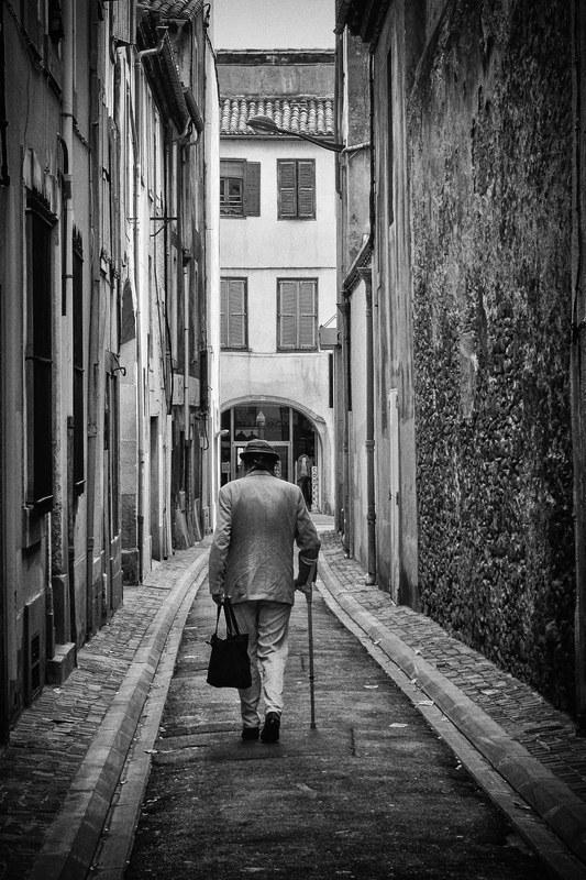
Exquisite stone detail. Effective and subtle vignette. The portrait orientation works well because it shows added street detail up to the 3rd story and rooftop and a peak of sky. I'm wondering if the composition would be stronger with a 6:8 or 5:7 proportion... sacrificing the sky and rooftop for throwing more attention to the person. Final thought: If only the man were a few inches more off horizontal middle. I think he is already slightly asymmetrical, but the image would be more harmonious if the viewer could see further through the archway destination. Great conversion.





 Add photograph to your favorites
 Add photographer to your favorites

 Photographer found comment helpful.


