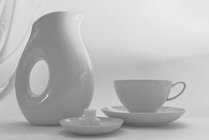
I really like this shot however it is a bit weak in connection to the theme but the interpretation of the theme is really wide for this challenge I can't really score you less for it :)
I don't understand this shot?
There seems to be too much white.
THe draping and wrinkling of the material to the left of the frame is distracting. There are odd reflections in the items and the white balance appears to be off? Also, the specks on various areas are distracting.
Perhaps this was what you were going for... a non-proportional shot? I hope so, after writing what I just did.
If that was your attempt, then well done. You definitely ensured this was lacking proportion.






 Add photograph to your favorites
 Add photographer to your favorites


 Photographer found comment helpful.


