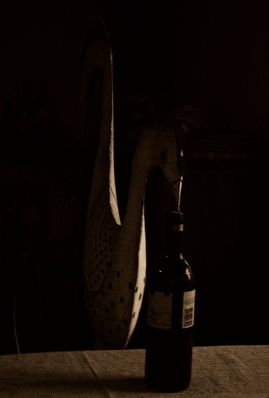
I think that this composition would be better with better lighting on the subjects. It is a bit too much on the dark side as that portions of the shape of wine bottle disappear on the dark backdrop. If you have a small spotlight you could put it behind the bottle to illuminate/outline it's shape better. The sculpture of a....bird....also needs a bit more light on it possible one on each side. Not sure how well the concept of You're Doing It Wrong comes across. I guess this is the wrong way to open a bottle perhaps?
This is sacked it. The thumbnail shows the bottle sitting on the table, but the Ctul image is roasted 90 degrees and stretched. Not sure how you did it, but something is defintely wrong!





 Add photograph to your favorites
 Add photographer to your favorites

 Photographer found comment helpful.


