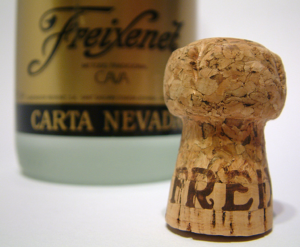
The cork from the bottle of Cava we drunk at midnight has a message. :-)
The title is not my native language. Our word for "free" is not the German "frei", but the Dutch "Vrij". That would spoil the message.
Camera setup: "Super"-Macro mode, autofocus, manual whitebalance, auto bracketing (this one is a 1/3th stop overexposed because of all the white that made the camera underexpose). The camera was about 4cm from the cork. Focus on "RE"
Situation setup: White photopaper curved up against the wall, white A5+ reflectorpaper on the right and three overhead spots.
Digital Processing: Cropped to framedimensions, manual levels, resampled, unsharp mask 200% 0,4 1, Save for web at app 85%.
This was nr 47. Had an interesting time with light, composition, macro function and aperture settings. Liked the last one the most.
Statistics
Place: 6 out of 46 Avg (all users): 6.3367 Avg (commenters): 8.0000 Avg (participants): 6.2326 Avg (non-participants): 6.4182 Views since voting: 1913 Votes: 98 Comments: 15 Favorites: 0
Hahahaha, I just got done reading your critique on my picture and came to this to critique some while I have time. This is random and I clicked on it and I got your shot.
~Critique Club Comment~
COMPOSITION- Composition is perfect on this. I like the use of thirds here and the cork is not centered. There is the same amount of space between the cork and the right of the shot and the bottle and the left of the shot. The subject is perfect for the theme of the challenge.
BACKGROUND- The aperature you used is perfect for the DOF in this shot. The choice to not go wide enough to totally blur out the writing on the bottle was good. The white was a good choice for a background. I thought of what it may look like in black but it would have been less of an impact on the black part of the bottle.
CAMERA WORK- Shutter speed and aperature are good. See comment above. I like that the bottle is still readable. The detail on the cork is very good.
DIGITAL PROCESSING- I don't see any hint of compression or artifacts. From the comments on my latest shot, you know the benifits of saving the largest file size you can for details.
MY OPINION- I had really liked this on during the voting of the challenge. It was in my top 3 or 4 in voting. I think technically it is almost perfect (the cork looks like it is tipping slightly) This is a great shot!
Whoohaaaaaaaaaaa!
Great & nice comments, a good position and a nice score. Made my week. :)
I tried it on its side, both the bottle and the cork, but it didn't look good enough to my taste. Also tried a black background, didn't look good with the bottle.
I hoped it would go for third, the score was up to 6.6 at one time, but suddenly it dropped to near 6.3.... Ah well, better luck next time, I wan't a ribbon within 5 years! :)
very well executed photo. maybe the cork should be on it's side.. feels too placed this way. (I mean, I KNOW it is placed.. but ....) On it's side might also add eye movement/interest rather than both objects in vertical. Just a thought.
The cork and wine(i think) seem to just be floating in mid air. It would be nice, maybe, if the background had a horizon in it, to relive the sense of chaos.






 Add photograph to your favorites
 Add photographer to your favorites

 Photographer found comment helpful.


