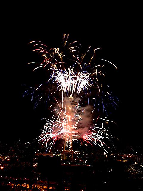
Composition/Content: Overall this is a really good photo. The Space needle leans a bit, but you can really get a sense of the size of this display.
Lighting: You did a very good job here. So often these kinds of pictures wind up with burned out fireworks. The time exposure coupled with a wide aperature often leave the pictures with white or very pale firework trails. The reds and blues came out very well.
Background: You might have a bit of extra negative space at the top and sides of the frame, but nothing fatal here.
The smoke adds interest, but at the same time, I would like to see a picture from earlier in the display. I think a cleaner picture might have worked better. As it is, the restaurant is obscured a bit, and unless you knew the Space Needle, (I do), it might not be quite so obvious.
In summary, a straighter Space Needle, a bit tighter cropping to reduce just a little of the extra space, and maybe a bit of the lights at the bottom of the scene, are about all I can add. You've already done a very good job to start with.
much nicer than the other space needle pic, however, you should have rotated and cropped the image in ps so that it wouldn't seem crooked...otherwise good pic
Cool photo, almost looks like a face of smoke on the space needle. Is it leaning a bit, or is it that my eyes are weary and seeing things at a tilt tonight?? Gave it an 8.





 Add photograph to your favorites
 Add photographer to your favorites

 Photographer found comment helpful.


