To tell the truth I can't explain to myself such low votes. Is Neat right? Have I offended the American pride? If some voters have had idea I find it silly. If the idea is 'this is not photographic' in nature, it's silly as well because there are very few images photographic in nature in the top ten.
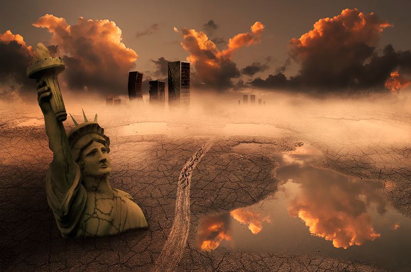
The idea came from the final scene of Planet of the Apes (the original one) but I opted for a urban scene instead of a seascape one. I had an entire story but no time to write it before the end of this challenge, so please forgive me :)
Statistics
Place: 7 out of 41 Avg (all users): 6.1550 Avg (commenters): 7.0000 Avg (participants): 5.7200 Avg (non-participants): 6.2596 Views since voting: 1871 Views during voting: 459 Votes: 129 Comments: 22 Favorites: 1 (view)
Lose the statue and it would improve 10 fold. The statue just cheapens the scene. And no, I'm not offended, just don't think it was processed properly.
Although I have NO idea why anyone would score this a one (and SIX of them?!), I agree that the statue's base is not realistic enough for a really high score.
I cropped the base of the statue off in my mind (with my hand...) and it improves the image greatly, in my opinion.
Naw -- I don't think you offended anyone, I think it's just because the statue looks disconnected and doesn't work in the shot. Some people are rather harsh on their votes. I gave it a 6 anyway because it was a good effort. It probably would have scored much higher without the statue. (or at least I would have scored it much higher without the statue. :)
As frequently happens I have a lot of things in mind but I should not waste them. Next time I'll spend more time on planning how the elements should be in the scene.
Hm. I am only 1 American voter, & I gave it a 10. We insult our own icons on a daily basis, I don't see how anyone could be offended by anything here. I did not much care for the cartoon-orange color, & there aren't enough buildings in the BG city. What looks like a path in the dirt made by cars turns out to be a 2-lane highway when I notice the people walking along it. The size of the people, the size of the highway, the size of Lady liberty, the size of the bldgs, the size of the cracks in the mud, all do not go very well together, but I gave it a 10 for the idea. You're off to a good start, don't be discouraged by a few 1's--you're in the top 10.
To tell the truth I have to say that Samantha's image is quite different from mine. My image has a lot of photographic elements and a realistic 'feel' (not enough to judge it a photo but less unrealistic than my Sagittarius entry). Some of those 1s could be attributed to some sort of American pride IMHO. In any case this was not intended as something against USA, but against humankind in general because of its attempt of destroying this world).
At the end of the story it's my fault, this image could have been better, and next time it will :)
6 ones, wow!!! Might of been the Americans, I can see this happening one day!
I really doubt it has to do with national pride issues. There have been more than a few comments in the threads from some members that they felt that expert entries need to look at feel like 'photographs' (as per the rules set) and not photoshopped combinations. I think your shot and Samantha_T's entry both suffered the '1's because they looked like photoshop works rather than photographs.
I really wish you had some more time to polish this one (especially the statue). I am convinced it has a great potential, as the general mood and colors work brilliantly together. The sky is superb too. Moreover, the caravan is fantastic, I really like this exile in the middle of nowhere. You need to find a way to make your baby sleep more ;-)
Statue of liberty has no "weight" in the scene, it is like it is cut out and stuck there (the left hand side blend is all wrong considering the lighting and background shadows/highlight)... that might explain some of the low votes (i didnt vote) as the whole effect is ruined by the jarring nature of the statue which doesnt quite "live" there - not to say you werent the only offender in this challenge but these things do count... that you got some 10's and 9's it testament to the quality of the rest of the composition - in fact it may have done better without the statue (less is more...)
I was surely not happy with the blending result of the statue. I left it as the last thing to fix, but it was late to properly think about its blending. But I couldn't get rid of it since it was the engine of the my main idea. Still I don't think that the blending of the statue can be the reason for receving a lot of 1s, since I can see the vast majority of the other entries very poorly edited, so one element can be the reason for this voting. I surely agree that most of the time 'less I more'... I should never forget it!
Statue of liberty has no "weight" in the scene, it is like it is cut out and stuck there (the left hand side blend is all wrong considering the lighting and background shadows/highlight)... that might explain some of the low votes (i didnt vote) as the whole effect is ruined by the jarring nature of the statue which doesnt quite "live" there - not to say you werent the only offender in this challenge but these things do count... that you got some 10's and 9's it testament to the quality of the rest of the composition - in fact it may have done better without the statue (less is more...)
I like the idea and I think sky, background and reflection are really nice, but that liberty statue on the foreground is really killing the image for me [voted earlier].







 Add photograph to your favorites
 Add photographer to your favorites


 Photographer found comment helpful.


