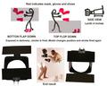
Used a plastic container. Cut a hole to fit camera's filter. Hinged two doors (like barn doors) to be able to expose half of the sensor indepently of the other half.
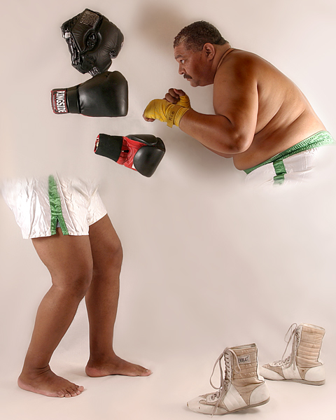
Set up mask and gloves in position with sticks projecting from the wall and outer glove with nylon thread and placed shoes on ground.
Camera set for 8 seconds and model is captured for first pose by hand firing the strobes. Model then assumes second position and again the strobe is fired. The shot begins with one door open. While model changes position I closed one door and open the other.
Retouched background with clone and then separated it and use gb. Levels on entire image and then isolated the head area, which gets light blocked by the mask and the gloves, and used livels to balance tones.
Hi pass filter in overlay mode and a slight um to finish.
One background strobe broke in process. Had to refix available lights. The shadow is that of the head mask and gloves, which was eliminated by light that broke.
Statistics
Place: 41 out of 69 Avg (all users): 6.5736 Avg (commenters): 7.6429 Avg (participants): 6.1964 Avg (non-participants): 6.6361 Views since voting: 3372 Views during voting: 1153 Votes: 394 Comments: 83 Favorites: 16 (view)
I would have to imagine that the only thing that kept this from placing higher was the assumption by many folks that this wasn't done within the rules. What a great, creative shot -- congrats for making us all scratch our heads!
This was the most creative image in the challenge and I hoped it would score in the top 3. When scoring yesterday, this was one of two of my 10's for the Master's Study. :)
Unbelievable creativity and originality in setting this up.. How'd you come up with the technique/idea? Did you read of it somewhere.. see it somewhere? Come up with it completely independantly? However, it's great.
Very interesting! Isure can't wait to see how you did this one. I have my thoughts but I will wait and see. Everything I see has great detail. Good work. 6
INteresting concept and a clear, well lit photo. The soft blur at the edges of visibility kind of upstage what's going on, IMO, b ut I still like how the drama is very present.
all i can say is "thank you!" i will always be able to point to this 'validated' image as an example of what's possible/acceptable. great job, all the way around. i have some ideas as to how you did this, but can't wait to get the real scoop! good luck!
I'll bet this shot got a DQ request within the first 5 minutes of voting. I could only imagine pulling this off with prints in the background. Regardless, it's a very clever idea that must have taken an ENORMOUS amount of effort. Should place near the top. I can't wait to see the details. (10)
No idea how you did it, but the model and composition is extremly good. The only thing is the shadow of the man on the wall. The left side doesn't have any shadow in the upper part - but it's probably a meaningless detail.
7. You have entirely too much time on your hands. Please lend me that excellent camera and sit down, wont you? :D Anyways, the pic is great. But I'm sure the 100+ comments before mine already said that. The photo, however, isn't that engaging. I like at it and I don't feel moved in any way. Perhaps it's the brilliant white 'studio-ish' background. I can't help but feel a dramatic dark lighting setup would set the stage for an "inner battle" of sorts. It would push the 'fight' instead of the technique. Great work!
Certainly looks like there was a lot of cloning out body parts, but I still think this is a brilliant image. Really made me think. Probably the shoes were stationary in place and then you had the subject change position in a long exposure and cloned out in ps. That's my best guess, but I hope you have a different explanation. 9
Very cute, interesting but I have a feeling it was more PS than actual photography, I could be wrong. I can't wait to read how this was done. I'm not a purist but I like more actual photo and PS, a 7
A very interesting take on the challenge - hope you post some how-to notes. This would really work well as a commercial for gym clothes or shoes, or similar. The model is a bit ironic - adding a bit of humor, doesn't look like he works out all that much. Both lighting and exposure very well done.
A clever photo, but just too clever! Moved from the realms of photography to graphic manipulation. Would have loved to vote it higher, but don't like the shadow blob above boxer's head. After another look, bumping it up.
This is one of the most amazing pictures I've seen! I hope you explained how you did this because this is definitely one I'm looking up to check that out after the challenge. It's perfect. 10
Great idea, neat image...but it doesn't appeal to me a whole lot. I know this must have been difficult to pull off, but the payout isn't there for me personally although I'm sure it will appeal to others...Great work, overall, though!
Edit: I'm scoring this a 6, because it's a neat idea but it just doesn't do a lot for me...
hahahaha, what a crazy idea! Very clever and unique! I'm a bit bummed about the shadows, as they're not quite consistent, but no that does not take away from how much I enjoyed this. What a great idea. Excellent!
Well, Nice attempt at trickery and you have succeeded. Thank god for big megapixel sensors, cutting and pasting and the horizontal flip function in photoshop! Big fat guys aren't usually appealing, and the rule holds true here!(oh yeah, I wouldn;t want to see myself like this either- being a big fat guy!) But seriously, is this digital art class? photoshop 101? If so check your lighting, the guys head is poorly lit, and his ass and shoulders are both lit. Nice try.
lighting etc is all good - my only beef is the faded line - I really think if would have cut that sharp it would have added a lot more impact. That aside a very good effot.
Woa, I'm floored!! Thanks for your PM, an amazing result you've got here. This really raises the bar for us all. This has to be one of the most technically accomplished shots on DPC. 10
the feathering at the waist is just too extreme to mesh with the sharp edges on the rest of the dislocated parts of the body. Interesting photo, though.
i looked at this a number of times, and sort of waited for it to be validated.
it's a very unique shot, but the blurry areas around the shorts keep drawing my eye. being an illusion type shot, everyone is apt to look very close.
I'm not sure what to say about this image. I like it, but it doesn't wow me. I admire the time and creativity that it took to create it and the compositional elements are well photographed but the post processing is uneven. You did a nice job masking out on the shoes gloves and headpiece where you have very crisp edges, but the trunks of both boxer you used feathered edges so it looks confusing to me. I think the scene is crowded in the frame too with the butts of both boxers edging to close to either side. A pretty good effort overall.
While I have absolutely no idea how you might have pulled this off, it is certainly a striking image and a top photo in this challenge. The concept is wonderful and very thought provoking. Great entry!
interesting idea and rather gr8 execution the only thing i would change if i was being pedantic is some of the shadows that have been cast.... aside from that there is the polarisation effect coming through on the image on the plain background and is somewhat bugging... the areas where you cloned out the image are the areas worst affected however that is easily changeable and that doesnt change the principle of the image whatsoever...
gr8 photo just a few areas of possible improvement though gr8 photo over all :)
Truly a great example of what can be done in editing. I also think that the concept is fablous. Toss in nearly perfect lighting, and my bet is that this is a very strong entry.
I don't know how you achieved this. I like it and yet I don't like it. I can't explain why, but if I figure it out I'll repost a comment (5).
Just wanted to add that I like the concept but I don't like how you split the body in half.
ok.... I can't wait to see how this was done!! I've probably spent more time on this photo than any other in the challenge! It looks like a double exposition but... not sure..... hmmmmmm... :-)
Great job, as with many others I'm sure, I look forward to the explanation of your steps on this one. One thing that bothers me is the right hand body is the only thing in the photo that is casting a shadow.
Even though I have had a bit of insight on how this was done, I'm still not sure if I prefer the results. It is very clever. Points for that. I guess it's just not my thing. I'm not 'into' it. Technically, it's very well done. Good focus, lighting and nothing distracting in the background. ~Heather~
This doesn't have much emotional appeal for me, but it's obvious you're creatiivity is above average and know how to make your gear work for you. I think this would get a higher rating from me if it were set in a boxing ring setting rather than a plain white background. That would probably make your technique more difficult, but would put the emotion back into it. Either way, kudos for an image worth taking a second look at!
I see it has been validated and am curious to find out how it was done, it feels like extensive photoshopped but apparently is not. It is a nice idea and the posture of the man on the right is dynamic, good. The left one looks a bit static, with both feet flat on the ground and with such a tight crop. I think it general it could have done with some more space around it.
great concept, but i don't love the execution. specifically i don't dig the graduated transitionon the shorts (fading out). i prefer how you did the boots with a clear-cut transition. lighting is pretty good, but a little overdone on the right. a reflector onthe left to brighten his face would have helped i think.
neat idea - out of the box.... i like that.
P-ness
"This photo has been validated." Seeing that text made me think HOW, well few hours later I'm still thinking it. The background is ugly and I dont like the shadows on it but the HOW factor is so strong that you will get a great score. Also extra point for showing off something new.
The creativity in taking this photo is amazing (I saw your photographer comments when you requested an admin note). To improve the shot I think cropping a bit further away from the man's shorts so they weren't up against the edge of the frame would be a good idea, and also the shadow from the right person is a little distracting. 7
Wonderfully unique and creative. Your submission stands out atop the Masters. If you are not Kiwiness you are his clone and that is quite a complement!
Not entirely sure how you accomplished this, but what a great concept! The lighting is a little harsh on the right hand side, and your shadows look a bit odd, but that's probably because of the nature of the photograph. Looking forward to seeing how it was done.







 Add photograph to your favorites
 Add photographer to your favorites

 Photographer found comment helpful.


