Photoshop CS5 Crop
Healed a dust bunny
Topaz Adjust - Something in the HDR pack and backed off on the adaptive exposure
Boosted vibrance
Resize
Sharpen
Resize
Sharpen
Resize
Sharpened the trees in the distance as an afterthought
Statistics
Place: 104 out of 239 Avg (all users): 5.7983 Avg (commenters): 0.0000 Avg (participants): 5.7073 Avg (non-participants): 6.0000 Views since voting: 709 Views during voting: 196 Votes: 119 Comments: 12 Favorites: 0
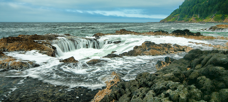
Whereas the subject matter is quite dynamic, the overall image is a little flat and therefore loses the impact it might otherwise have. I think perhaps the crop or angle may have some bearing on this. Some added contrast would have helped make the image pop. I have trouble finding a point of reference when looking at it as the elements are all about the same intensity. I believe the short crop of the sky is a detriment to this particular image. Hope this helps, better luck next time.
I gave it a 6. It is good, but didn't wow me somehow. There seems to be a bit of a color cast to it and perhaps a tad oversharp in some places. It's a good photo and the sort that will have your friends and family wowing about what a great photographer you are. The DPC collective has been desensitized by so many "wow" entries of wideangle seascapes with brilliant colors that this probably got compared to the rest of the genre, even if unconsciously.
I gave this an 8. I really like your use of a foreground element to add the illusion of 3 dimensions. Excellent control of exposure, with no details lost in highlights or shadows. Your horizon line is level. The ocean is dramatic with good use of silk water effect. One of the more natural and beautiful seascapes I've seen on this site. The proportions of the image are long. Some people use those black bars above and below to make the image look better on the voting page. Don't know why that helps, but it does seem to improve visual appeal. I wouldn't worry about your score, which is too low for the caliber of the image. The current set of voters is difficult to figure out. Better to lean on what you like and ignore the finicky.
Since your "subject" is a (fairly) well-known and dynamic feature, I think you might have done better with a tighter crop.
The lighting seems a little odd, like it can't decide between gloomy overcast or partly-sunny. If I were to try re-editing (starting from where it is now) I'd probably try and boost the contrast with an "S"-shaped Curve on the RGB Channel, and maybe try and boost the blue in the sky/sea and the yellows in the land with a separate Curve on the Blue Channel.
You might also try using the "high-radius UnSharp Mask" technique -- I find it helps make a landscape "pop" a little more ... for a DPC entry-sized image try using the UnSharp Mask filter at 15% | 50 px radius | Threshold = 0
That's not a bad score for a free study! Didn't vote but as others have mentioned dpc usually punishes nonstandard dimensions. Agree that the blue color cast contributes to lack of pop. Try futzing with channel mixer. Pump up your contrasting colors, like those orange weeds. And if you decide to do expert editing, stick a seagull on that foreground rock ;-)
You can use dofmaster to calculate ... personally I always add on a little just to make sure!
The light is fairly flat, an hour or so before sunset would make the light come alive more
cropped in a bit tighter could have helped ... maybe also trying a longer exposure, say 1s, and timing it to leave some longer wave trails a bit like the front of your shot.
As others have said, white balance looks a little off too, can be changed if shooting in RAW or just by adjusting the colour balance if shot as jpg
I didn't vote but I wouldn't have given it anymore than a 6.
I think the subject is awesome! But the execution of showing the subject is pretty bland. It seems like the colors are a bit flat, and the depth of field is too short. A lot of the "wow" landscapes like this have EVERYTHING in focus. And I think that is what you might have missed here.
Like I said though, the subject is awesome... And I think if it were done right, it could have been a top 10 no problem.
For a single layer shot I don't think I could have done much better than f/18 for DOF. That shallow DOF comment haunts me no matter what I do.
A great location - love the waterfall feel of the image. With regard to the score, I am guessing the long crop cost you some. It seems the more pixels you include in an entry, the larger the score and this image is very pixel starved due to the narrow crop. The sky seems to be cramped at the top.
The white balance also appears to be too cool, with the whites in the water almost appear to have an odd blue tone to them. I am sure it was not possible, but I wonder if a higher vantage point woudl have helped the image, so we would get a betters sense of the size and shape of the Well.
Personally, I liked the shot, but I think a 'warmer' tone and a taller crop would have helped you out quite a bit.
I didn't vote but I wouldn't have given it anymore than a 6.
I think the subject is awesome! But the execution of showing the subject is pretty bland. It seems like the colors are a bit flat, and the depth of field is too short. A lot of the "wow" landscapes like this have EVERYTHING in focus. And I think that is what you might have missed here.
Like I said though, the subject is awesome... And I think if it were done right, it could have been a top 10 no problem.
I looked at this shot several times during the challenge. I was one of your 5 voters. I felt the shot was good overall had good sharpness and color. The composition was very good with excellent foreground, midground and background elements. I think it lacked luminosity. The light is very even out there and the sky is fairly overcast and dull grey. It does have some interest but overall I felt the light of the day was not very good. You represented the scene very well in your shot. So I would say it wasn't anything you did in particular, just the light at that time did not help the scene. I probably should have bumped you up to a 6 as the processing and camera work was solid overall. Personally I think 5.7xxx is a good score for this and puts it above your average score!





 Add photograph to your favorites
 Add photographer to your favorites

 Photographer found comment helpful.


