Author Thread Comments Made During the Challenge
Post actions
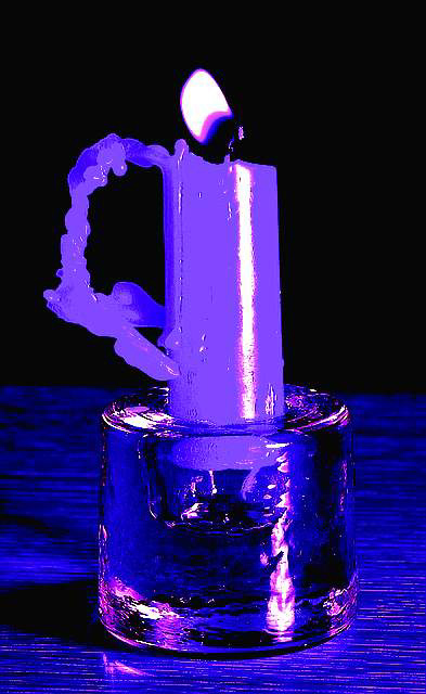
The change of colour makes the image look too unnatural.
Post actions
great idea but the colors aren't working together very well.
Post actions
This is interesting, but IMHO, overly manipulated color. Cute title, but prolly not well accepted. Challenge met. Sorry 5, Swash
Post actions
Heh...... Funny.
Post actions
I'm trying to understand the use of over saturation. Nice colours, but looks too saturated to me. Good luck. Jacko.
Post actions
I KNOW IT IS NOT YOUR FAULT BUT I AM REALLY TIRED OF THE CANDLE IN THE WIND REFERENCES
Post actions
I really don't like all that was done to the shot after it was taken. The blue hue really does nothing for the shot.2.
Post actions
Very nice effect, and quite a good photograph. JEM
Post actions
very funny title! colors are interesting. composition is not entirely interesting.
Post actions
Neat Idea...although not so original, but I find the picture's colours are just too oversaturated. Maybe the shot would have been better without so much processing.







 Add photograph to your favorites
 Add photographer to your favorites


