|
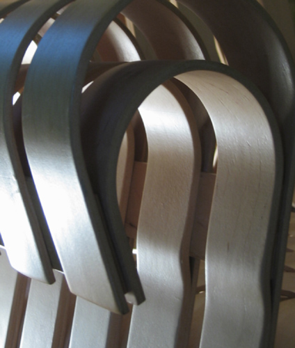
This is a great idea, but I would have liked to have seen a slight larger image, and maybe a crop that didn't cut off the second slat in the upper left. The colors seem a little desaturated as well and flat. I think if you added a little more contrast, it would help sell the lighting. |






 Add photograph to your favorites
 Add photographer to your favorites


