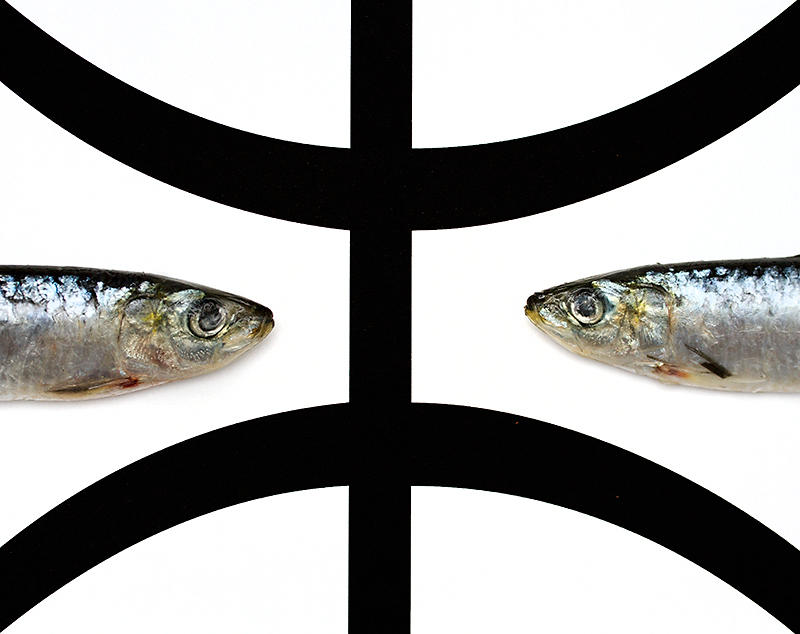
Now that is a very bold presentation! I find it interesting how you placed the fish within the sign for Pisces. The bold lines of the pisces sign really draws the eye in and then leads you too the two fish. My first thought was the sign is on it's side and should be oriented the correct way. However, if you did that, it would change the whole dynamic of the composition because the fish will have to remain placed between those two curves.
#1
Simple. On the bottom arch on the right side there are two red spots, those need to be cleaned up, but otherwise the image is spot on. It's expert editing so the non-photos will mop this up, but I did my part to help you out.







 Add photograph to your favorites
 Add photographer to your favorites

 Photographer found comment helpful.


