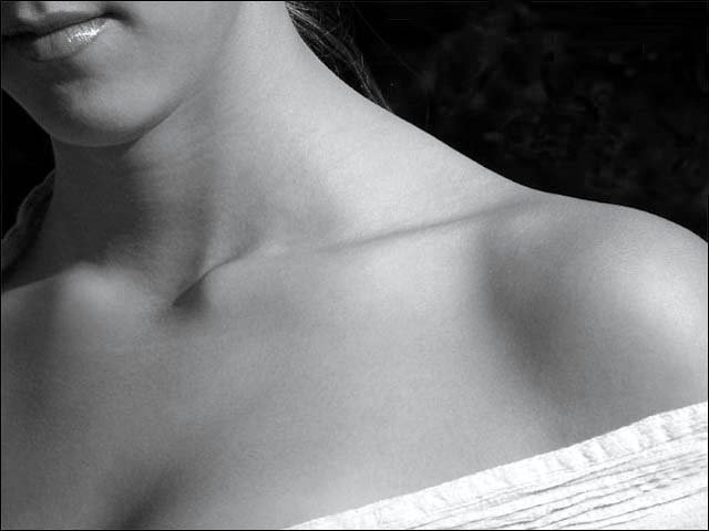
Heh, when I see/hear the word "essence" I think about Emeril Lagasse. But your photo captures a different essence: that of a woman's neck and shoulders. Graceful curves and shadowplay are this photo's strong points. Not sure what's going on in the background but I would have preferred a solid color vs that mottled pattern that resembles noise. 7
boy, i don't know what to do about this image. i want to like it, but i find reasons not to (like why couldn't the background either be completely flat or a little busier. or do i like the lips pulling me off the image, being up in the top corner). i want to not like it, but i find reasons that i do (like the lighting, the lines, the hint of modesty). i guess i like it more than i don't like it. i'm sorry i can't tell you any more. good luck!
This was a real ringer for me in this challenge… many others have a completely different wow factor. Was that what you were trying to achieve? The ‘Essence’ for me evoked PURE sensuality! So beautiful are each and every line and curve! I prefer color in most photos yet the use of black & white on this works very well. The focus shows great detail yet enhances the theme of soft and sensual. You deserve to do well with this !
6. A bit plain for my taste. Nothing in the pic is truly holding my attention. I look to the lips, but no smile or expression. I look to the shoulder but it's rather flat and plain. Overall just a bit too simple for me.
Looks like this image is about textures. Nice lighting and great composition. I like the subtle interplay of shadows/light. The rich black of the background really help to bring out the glow of her skin I also like the way you took just a part of the body and used it to make an interesting composition. A very suggestive image. Well done. 9
I really thought I would like this alot, from the thumbnail, but I find the photo lacks a littl in full size. I guess I was expecting to see more texture in her skin, like goosebumps on her shoulder and neck. Still very nice composition and excellent lighting.
This one would have worked for the "parts" challenge too. I like the black and white. The cropping really doesn't do it for me. I would have prefered a closer crop of maybe the shoulder and fabric. Also softening the shadows in the clavical area might have been better.
nicely done, something like what I would have in mind for the "parts" challenge and now "distinguishing features" but don't have the knowledge or model to do this well.
Great shot!! The tones in the skin are perfect, very good use of light!! The exposure is brilliant too, can feel the texture in her white top. Good idea not to show her whole face, leaves us thinking about her face more... 9
The picture is so well done photographically! The soft skin tones, and the shine of her lipstick. It's a very good looking picture. I'm giving it an 8, only because the crop doesn't appeal to me as much as it would have seeing more of her face.
Me eyes keep moving around from her lips, to her shoulder, to the shadow of her breast. It might have been your intention, also considering the title. I wonder how it would have looked with a nice piece of jewelry as focal point.
I like the composition, specially the positioning of the lips in this photograph. Not sure, but may be a little darker b/w might add more to this photo. the white dress is too overexposed on my screen
A wonderful, understated shot. Nothing of great interest in the shot but for some reason the compositon and the set up hold my attention longer than it should. The lines of the cloth, her shoulder, leading me around the shot is very well done. Just a touch more contrast would make this perfect. Seems just a tad dull, just a tad. a9
Very nice study, but the high gloss on her lip is very distracting...there could be more shadow play on the collar bone, and maybe the slip of hair on her neck could go...but overall I think it's great, and I love the small show of fabric on the bottom. Nice contrast. Thankee!
I like the composition, and i especially like the textures, lips, skin, dress, I might have shown a touch more top but reasonable minds can disagree. THis does sum up one of the sexiest "parts" or "erogenous zones" on a woman.
I keep staring at this shot because the neck seems a bit distorted, and under the chin there is a distracting something, but the lighting and skin make this a great shot.
Not really sure what this photo is trying to convey - having that much body seems to create a flat feeling - being that she is straight on and there is no 'form' to the human shape.
Also the background is very mottled which I find quite distracting. It looks like finger prints on my screen :D
Very interesting shot, unusual composition. The bones around the neck look a little awkward to me though, rather than graceful which is what I think you were going for. The top seems a little to bright compared to the rest of the frame and becomes too much of a distracting element. I noticed some artifacting, and can't believe how small you've made this file (about 28k). Why not save at 150k? 6
Lovely interpretation. A very unusual crop, betraying a good eye and vision behind it. It's stuff like this that I appreciate about DPC - I learn from looking at photos like this. The expanse of skin with the lips and material of the dress framing the corners is exquisite.
gr8 photo and interesting angle... though i would have liked to see a tad more of the face and possibly half the face ... it would have been interesting to see her eyes though the light on the collar bone is rather fascinationg.... possibly look at removing altogether the item of clothing from that section and slightly toning down the glare off the lips though this is one gr8 photo and provides alot of room for fascination in the shadows cast by the light...
gr8 photo so congratulations :)
a very sexy and beautiful image. the cropping is terrific, bringing me into an intimate setting with the woman where my eye is dran to her shoulder and neck. The lips seem a little crowded in the top left of the frame, but a very nice effect overall.
Nice lighting and skin tones. Keep her around for the parts challenge. I think you would have done well if you had made it a complete portrait this time, as you have all of the tech stuff right on. 7
grandma/suck eggs risk..but...would have lost hair strand and darker neck/shoulder/clothing to left while keeping the great mouth position. I love it though!
I'm not sure if I understand this photo, really. It is an interesting composition, it just doesn't appeal to me. The rigid abruptness of the collar bone takes away from the lips and the shirt. Perhaps the shot might be better taken of her back and have her looking over her shoulder? also, I think the hair that is visible distracts. 5
Wonderful, the small amount of dress or towel in the lower right makes it. Sometimes it is better to see a bit of clothing than none at all. It can actually be more alluring as it is in this shot. I like the lips in the upper corner as well.
Clean, simple shot with smooth skin tones and good detail. The edge of the towel is a little washed out, and the reflection on her lip gloss is somewhat distracting. The dark background has some unintelligible detail that's a little distracting to my eye.
Yummy shoulder and neckline. This kind of shot leaves one sensing aroma and touch thanks to what you have left out of the frame. Your model looks gorgeous and I bet she smells nice too. : )
A provocative shot. My only comment is that the lighting is a touch flat and could have been more atmospheric.
I like this shot but I think it is let down in post-processing. I really feel it should have some soft focus applied to it, not only to make it more dreamy, but to increase the tonal contrast in the skin to stop it looking so flat. Also, a warmer sepia might be nicer than B&W. 5







 Add photograph to your favorites
 Add photographer to your favorites


