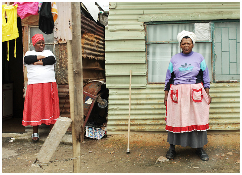
I'm glad you kept it color. Sometimes the genre is so inundated with BW that we forget how great color really can be without being over the top saturated and crazy neon colored.
I see many suggestions that this would be better in bw, but I love the splashes of color and the contrast with their expressions. Congratulations on the top ten.
I really love this. It makes me wonder what it must be like to live like these two women live and to know the things they know and to experience the mundane with them. What kind of dreams do these women have? Are they merely surviving? What do they think about? What do they feel?
Well, I laughed. Great expressions on the ladies. Large pole makes an awkward composition that splits the image and makes the connection with the women more distant. Perhaps a slight desat on the yellow channel could tome down the bright yellow shirt. A vignette may also have given the image some pop.
I think I've found my favorite for this challenge. Nicely framed, clear, colorful without being overprocessed, and interesting subjects! What is their body language saying? It invites the viewer to wonder.
"Look at dat missus Jones ober derr, mon, tinkin she's all dat! Her grass ain't no greener dan mine, mon." *sorry if my Jamaican accent is a little rusty. ...even sorrier if this is Chicago. ;-)
Originally scored this as a "1"-- soley on title alone.
But have changed it becasue I really love the image and don't want to drag it down.
But my feelings remain the same as what I wrote previous.. with regard to this being a sad exploitation of people in troubled times....for humor.
Great characters in this pic, and the details of the washing and repaired window are great. I am interested in your choice to keep it colour, because I would have thought B/W would immediately improve this?





 Add photograph to your favorites
 Add photographer to your favorites

 Photographer found comment helpful.


