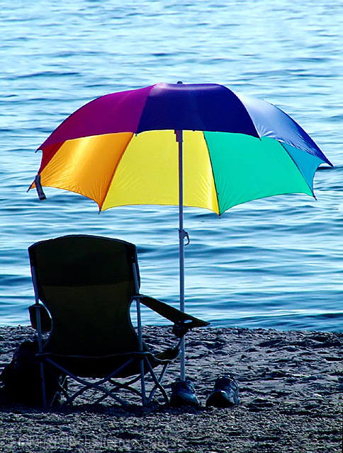
I dont know about that critique ambaker left cause what I see the colors look awesome. Remember people are color blind. I dont think I am and I can not be sure, the eye doctor said my eyes seem to be fine as I only wear contacts for far sight. Anyways I was drawn to this by the thumbnail and my first thought was of how wonderfull of example for color management this was. I am studying color management so to test my ability of understanding this and telling you I may be right on my opinion is to only test it with the calculations of color...Did you use a light meter here? (I cant remember what those things are called. Meter something)
Composition is good, but colors run cool. The heaviness of the blue makes the picture look cold. First thing that comes to mind is that it is too cold to swim today. This almost looks like it could be a beach in Alaska. The darkness of the picture almost renders the chair as an outline.
Depth of field is good also. Did you use zoom? Things look a little compressed as if a higher level of zoom was used.
Overall a good picture and with some editing for color and brightness it could be very good. All the basic structures are there.
nice shot - though the umbrella would have been brilliant for this weeks open challenge. water is very enticing, must confess - though the beach is a bit on the grey side... 6.
I love the colors and the smoothness of the water. Just my opinion, I would have removed the shoes and the bag to simplify the elements, but otherwise it's definitely an eye-catcher!







 Add photograph to your favorites
 Add photographer to your favorites

 Photographer found comment helpful.


