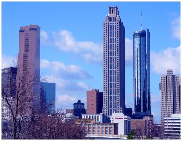
Hmmm, I wasn't super impressed nor was I super un-impressed with this photo. A very solid medium. At the first look, it's very difficult to connect the skyline with Travel. But it's certainly there. Sure the NYC skyline would be better or the HOLLYWOOD sign but I doubt going to one of these places just for DPC is worth the effort ;)
That mirrored building to the right looks really interesting. I think you should have tried to emphasize on that. The trees to the left don't really add anything to the composition. And as others have mentioned this has a strange blue tint to it that probably cost you some points.
Ah, another thing I just noticed is some distortion. I think using your zoom tends to minimize the distortion.
I love the blue sky and the peaceful clouds. I find it pretty tough to get a good sky. Good try, I look forward to seeing some of your other entries.
Nice composition, but very blue looking - overall. Intentional? Over-exposure and soft focus makes the names on buildings difficult to read, which I find distracting - a little.
The sky is nice, but it doesn't have much oomph to it; you might consider cropping out the sides and keeping the towers in the center; skinny, but it'd be effective.
You made it look better than it really does. When you live here you go somewhere else to vacation and take pictures. This is a really exceptionally good photo with just one problem in my opinion. The blue tint could stand to be lightened a little for my personal tastes. Other than that this is poster or postcard quality work. Right now I'm torn between 9 & 10. Because of the tint I'm going with 9, but may change my mind before Sunday night. PTL







 Add photograph to your favorites
 Add photographer to your favorites

 Photographer found comment helpful.


