Author Thread
Post actions
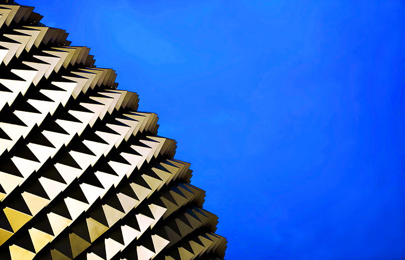
I loved this shot. Well composed. It should have finished higher in my opinion -- blue is the primary color of the image even if the actual architecture is not. Great shot.
Comments Made During the Challenge
Post actions
Great use of negative space! Would have voted higher if the architecture itself was blue, but still gave it a 7 because it's so striking.
Post actions
Fascinating shapes! This reminds me of a place I visited in Fremantle, Western Australia.
Post actions
The theme is architecture in blue not blue sky. I see no blue architecture so can't give a high score. sorry..
Post actions
artistically done, but this reeks of DNMC to me, I would of preferred a building in blue, you also have some banding in the sky as well.
Post actions
An interesting use of complimentary colors and patterns.
Post actions
Post actions
Architecture isn't blue.. but the primary colour is. I rate it high but I wonder if others will dock you for it. Good luck!
Post actions
This looks awesome. Love the contrast.





 Add photograph to your favorites
 Add photographer to your favorites


 Photographer found comment helpful.


