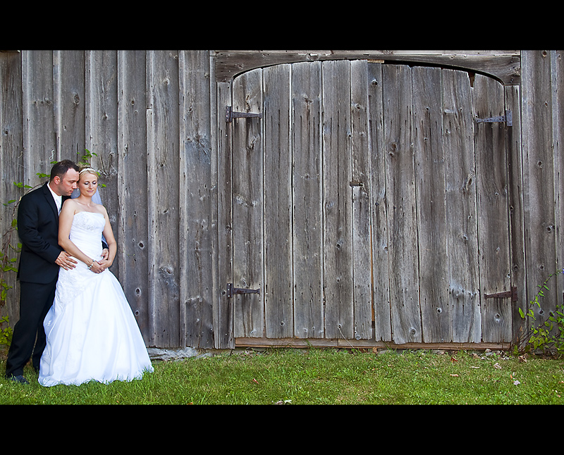
seems like you have left them out, all for the golden rule but thats thirds, the door distracts heavily in the negative space, they wanted to be over on the other side with more blank space between them and the edge. the uneven crop/border as well really doesnt do it for me.
I'd like to see them either be a more prominent element or to have the extra space be more empty. For me, this is a shot of a door or a barn, with a couple thrown in, when in fact, it's a couple with a barn door that is secondary or happenstance, a mere background. Lighting them selectively either through editing or in situ lights would have accomplished this while still keeping the same sort of a feel.






 Add photograph to your favorites
 Add photographer to your favorites


 Photographer found comment helpful.


