The imperial Palace in China. Hmmm the title makes me want to go there (I love Asia). Looking at this picture doesn’t really help that, and that was the meaning of this challenge.
Take a picture that would go in a travel guide. Even though you’ve made an interesting photo, you scored low (lowest personal scoring ever as far as I have seen). It’s not because it’s a bad photo, but it’s because the voter doesn’t see it in a travel guide.
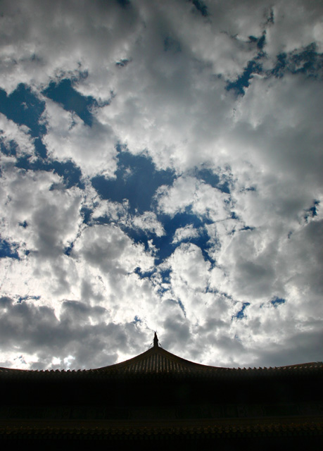
I think if you had taken a photo of the palace itself, with a bit less sky, it would score much higher.
Take a look at the highest scoring photo’s watch what they did and how they scored.
As much as I love negative space, I just think it didn’t work really well for this photo, the sky is just not interesting enough. If you had used some kind of filter (Gradual ND, or color filter), or waited for sunset maybe it would have worked better, but now it’s just pure sky.
You’ve voted yourself, so you know how it is, a picture comes up, you look, press a number and the next one comes up. 1 or 2 seconds per photo, only stopping for the WOW’s.
If people don’t see what they expect they vote low, if they don’t know what you are trying to say, they vote low. And you see the result, a good photo, but a bad score.
Keep in mind that we are a community with lot’s of different people and you have to keep your photo’s easy and understandable.
Keep up the good work.
If you have any questions, comments or other things about this critique, or are bored and want to spam someone just PM me.
I think this photo is underrated. Ideally, there would've been more light cast on the building itself, so it wouldn't have been silhouetted against the sky, but I like the composition and perspective. No way this shot should've been left on the last page!
Very dramatic and engaging image! Since this is for a travel brochure, it may be interesting to try dodging in the structure at bottom so it's not just a sillhouette. Nice work! 8
nice arse! (well, i think it looks like a lovely ladies back and bum. i can't be the only one who has said this).
sky is very pleasant and interesting to look at, but then focus should be on the travel-type stuff, and a silhouette of a roof (no matter how pleasingly suggestive it might be) doesn't really scream "put me in a travel guide". with the architecture that is evident from this shot, i think a little less emphasis on the sky might improve your overall score. for me, a 4.
Funny thing - looking at the thumbnail I could swear it's a butt with a texture of sky :) lol
Full size makes much better impression though. Well done.
imperial ass... sorry but couldn't help... very nice photo and gracefully done... but the shape of the roof makes the sky+clouds looks like an butt. too bad I cannot rate (not a member yet) because it would get a high rating from me... keep it going





 Add photograph to your favorites
 Add photographer to your favorites


 Photographer found comment helpful.


