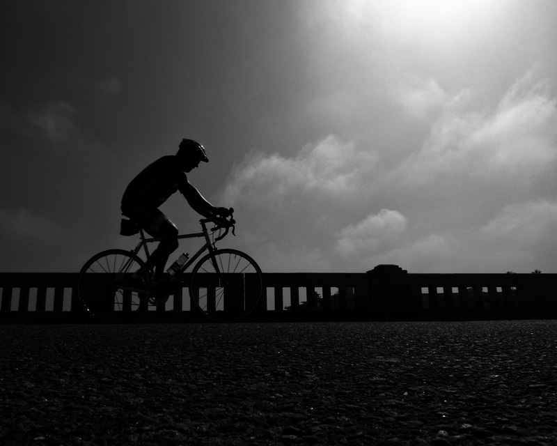
This is a bridge that is bikes only near Marina del Rey. Tons of cyclists stop here to rest, take in the sights, etc. Fisherman hang out here as well. The little tributary underneath is home to the crews from UCLA. Nice place to visit!
Post challenge - is this too dark? When viewed on my phone most of the foreground is lost. On my computer there is considerable detail in the foreground (camera was on the ground, pointed up).
Statistics
Place: 68 out of 120 Avg (all users): 5.5758 Avg (commenters): 4.0000 Avg (participants): 5.4200 Avg (non-participants): 5.6707 Views since voting: 489 Views during voting: 224 Votes: 132 Comments: 5 Favorites: 0
Deb, I gave you a 6. I like your idea for a silhouette and the sturdy railing is a nice backdrop. I wish there was more detail in the asphalt. My preference on composition would be to crop about 25% off the top and maybe some off the right. If you made these changes it would be nice to see more pavement below so the horizon isn't dead center. I'm a sucker for textures and this has great potential. If I look at this later I might have a different idea ;-) It's really what you like that matters.
I'm tempted to say it is too dark, but what does that mean? What is marvelous here is the light, and how it rains on the cyclist at the same slant at which the clouds have chosen to arrange themselves. The foreground is interesting/puzzling: tell me you didn't put the mighty lumix down on the wet sand.... Were there more light and detail in the foreground would it lose the drama in the sky and the cyclist?
Deb - in some ways I think it may be a bit too dark, especially in the sky.
I voted in this challenge and gave it a 6. The 6 score was for a good shot meeting the challenge, but lacking in a couple areas. First, I am not crazy about the near square crop, it takes away from the line that you are almost creating with the road and the barrier. Using a more standard landscape crop would have provided more direction of the photo (try cropping the bottom asphalt to leave the sky?) Second, the foreground asphalt is not adding much to the shot but taking up valuable pixel real estate. Third, I think the silhouette would have been more dramatic (higher scoring) had the sun been more behind the rider rather than off to the side. I think you could have rectified this to some degree with playing with layers to brighten the sky and keep the rider dark, but that is just one approach to do it post snap.






 Add photograph to your favorites
 Add photographer to your favorites

 Photographer found comment helpful.


