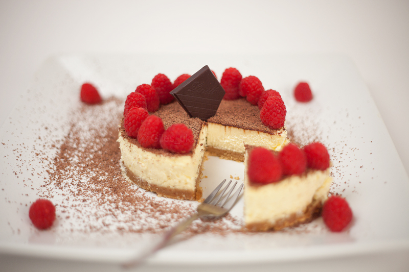
This is an attractive presentation and the lighting, focus and colors are good. However, I think the cropping is far too wide. I don't feel like you need to include all four corners of the plate, all four extra raspberries and all the cocoa powder, or even the whole dessert. Also, the depth of the fork compared to the DOF makes the tip disappear into blurriness and that looks a little strange.
Lighting and arrangement of the dessert of the plate is stunning - showcasing this dessert to the max. I love the details of the chocolate dusting on the top of the cheesecake. The whites look rich and creamy and the rasberries provide the burst of red to color the scene. You made the plate very inviting and tempting to your audience - one just wants to reach out, pick up that fork and start eating. Love the little detail of a slice cut out of the cake so we can see the inside. It also is a subtle way to project the audience into the scene - as it is like we cut the cake and are getting ready to sit down and eat. Stunning work - well done!
Nice bokeh, good focal point. I think with more aggressive cropping it could have been a lot more powerful. About 75% of the image is really not necessary to say what you are intending.
This is a tough challenge to vote. I'm torn between "what are you trying to do here" and "what do I expect here". Further complicating matters is the question "what would I do here".
What I would expect would be a technically strong piece of eye-candy that would present the dessert in a way that I would want to at least sample it, if not order it. Along these lines I'm looking at technicals: backgrounds, distracting elements, exposure, sharpness. I'm also looking for creativity, imagination, and originality, which can make up for less than perfect technicals.
So, where does this leave me with your image?
Nice idea, and not badly shot. However, I think that a much, much tighter crop would have given you a much, much stronger image. Take a look at 25% off the left, 20% off the right, and 20-25% off the top. All that wasted space takes away from the impact. Very nice composition, though.
Catchy...almost looks like not enough dessert to fill me up though. Nice use of focus here to highlight the main subjedt. almost looks like tilt shift..It may be but I'm not familiar enough with the process to know the difference. Anyhow nice shot well executed.





 Add photograph to your favorites
 Add photographer to your favorites


 Photographer found comment helpful.


