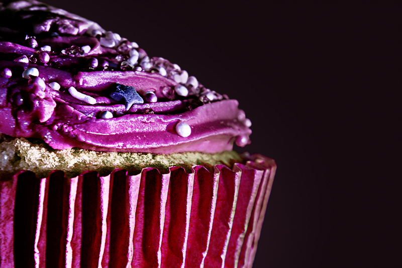
I really like that you took a more artistic approach and didn't just make a pretty dessert and present it formally. For this one I would prefer the contrast not be dialed up quite as high but I like how it gives your pink cupcake a more sinister look! The cupcake seems to disappear into the background on the upper left corner, and if the entire left side did that it would have been nice to see that in the frame.
Love the balance, the crop, and the focus. The colors are interesting, though not terribly appetizing. I might like to see a slightly higher angle so the cupcake wrapper doesn't split the image in half so harshly. Still, the image is well done.
This is a tough challenge to vote. I'm torn between "what are you trying to do here" and "what do I expect here". Further complicating matters is the question "what would I do here".
What I would expect would be a technically strong piece of eye-candy that would present the dessert in a way that I would want to at least sample it, if not order it. Along these lines I'm looking at technicals: backgrounds, distracting elements, exposure, sharpness. I'm also looking for creativity, imagination, and originality, which can make up for less than perfect technicals.
So, where does this leave me with your image?
Sorry, but I'm loving it and that usually means dpc won't. I love the colors; just wish there was a little more detail in the shadows and maybe a little more DoF. I also think a square crop from the left would have made this a bit stronger.
First off the strengths of the image: You bring the viewer up close and personal with this tasty treat. We can see all the details adorning this cupcake. The composition is also interesting in that you showcase only half making it appear larger - this is a big treat. The colors of the treat really pop off the plain black backdrop that allows it to visually pop.
The biggest weakness of the image lays with the harsh lighting and or processing that brings in harsh contrasts/shadows on the icing of the cupcake and the pink wrapper that makes it look dark and 'burned'. I think better lighting and evenly illuminates the cupcake without introducing hard/deep shadows will help increase the visual appeal of the treat.





 Add photograph to your favorites
 Add photographer to your favorites


 Photographer found comment helpful.


