I'm actually rather annoyed now. After submitting my entry, I went back to fix a whole bunch of things and ran out of time and couldn't upload the newer and imho better version. Damn
Either way. I still love the shot.
Statistics
Place: 46 out of 51 Avg (all users): 4.7541 Avg (commenters): 6.0000 Avg (participants): 4.5313 Avg (non-participants): 4.8333 Views since voting: 367 Views during voting: 254 Votes: 122 Comments: 15 Favorites: 0
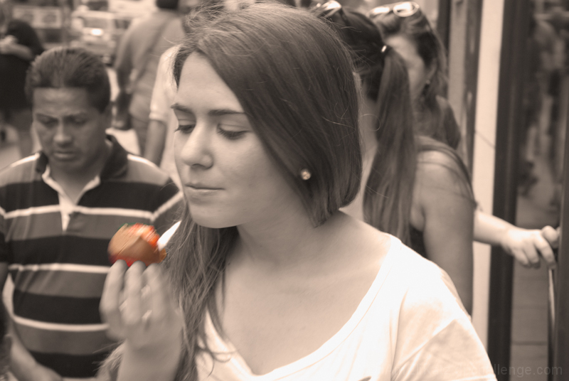
I like the use of color to draw the eye to the focal point. Being the focal point, it would be better if the strawberry were clear. This concept would work really well if the model and strawberry were both clear but the people in the background were out of focus and motion blurred. There are too many distracting elements in the background that could have been cropped out, particularly the sad-looking guy and the hand.
Not my most favorite image, sorry. I would have moved her to the right of the frame to give her some room to look into. The motion blur and more so the guy in the background distract from your subject.
This is a tough challenge to vote. I'm torn between "what are you trying to do here" and "what do I expect here". Further complicating matters is the question "what would I do here".
What I would expect would be a technically strong piece of eye-candy that would present the dessert in a way that I would want to at least sample it, if not order it. Along these lines I'm looking at technicals: backgrounds, distracting elements, exposure, sharpness. I'm also looking for creativity, imagination, and originality, which can make up for less than perfect technicals.
So, where does this leave me with your image?
The desat doesn't work for me. It just screams shoe-horn. On the other hand, if you'd cropped it square from the left and toned it straight bw, I would have thought you'd put in a nice take on the challenge. Just my opinion, though.
Not quite sure what to do with this one. I like the idea, but the oof food and hand is bothering me. I like that it adds a sense of movement, but it seems to be in between comfort zones -- either more blurred or less blurred would work better, imo. Also, the tinting of the photo clashes with the dessert. Yet I like the idea of the colored tinting, but the color just seems off.
I want to give it more than a 5, but as it is, that's where it ends up. But it could have gone as high as an 8 if things flowed a bit better.





 Add photograph to your favorites
 Add photographer to your favorites

 Photographer found comment helpful.


